create a dot plot
Dot plots are great charts to have in your repertoire. They come in many forms, but the two I find myself using the most frequently are the Cleveland and the connected dot plot.

Unfortunately, many graphing tools don’t include dot plots in their default charting options—including Excel, my preferred graphing tool. To build a dot plot in Excel, you need to get creative and format an existing chart to present as a dot plot.
It sounds like some sort of wizardry, yet hopefully, this article will take the magic out of the process, enabling you to build dot plots and other custom creations.
There are multiple ways to go about this. You could make a dot plot in Excel out of a stacked bar chart, a line graph, or an XY scatterplot. As the old adage goes, “There are many paths to the top of the mountain, but the view is always the same.”
Today, I’ll share my preferred approach for making dot plots using an XY scatterplot. The good news is that once you learn how to make one, you basically know how to create the other because the connected dot plot builds off of the Cleveland version.
To illustrate the steps, I’ll use the data from a community exercise: a matter of taste.

Let’s jump in!
Build a Cleveland dot plot in Excel
Add a SPACING series. For dot plots, we’ll need to add an additional series that will space out the dots vertically, so they don’t overlap in the scatterplot. My dataset looks like the following.

The values for my SPACING series are arbitrary. I tend to use numbers that end in 0.5 rather than whole numbers for reasons that will make sense once we get to the Connected dot plot.
Insert an XY Scatter chart. Now that we have our three data series, it’s time to add our XY scatterplot. Highlight the CREAMERY series, press CTRL (COMMAND for Mac users), and highlight the SPACING series. Then navigate to the Insert tab and choose the options for Scatter. The resulting graph should look like the following.
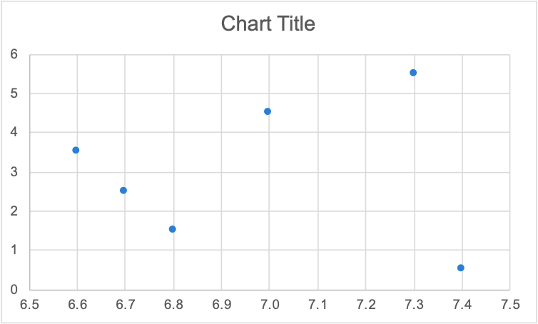
Add a second series to the XY Scatter chart. Next, right-click on the graph, and choose Select Data. You can then click the plus button to add a series. Choose the DAIRY GIRL values for the x-values and SPACING for the y-values.

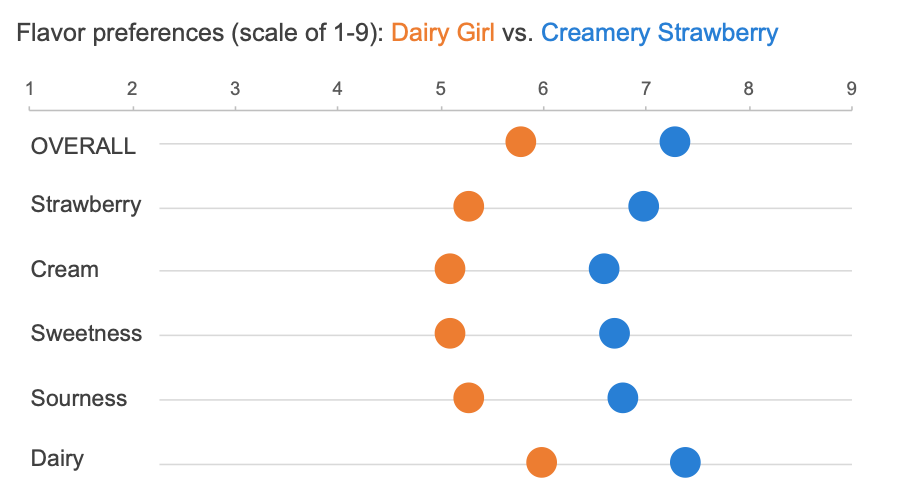
Adjust the axes. Hopefully, you can start to see the dot plot taking shape. To align the horizontal gridlines, I’ll change the starting value of my vertical axis from 0 to 0.5. For my horizontal axis, I’ll change the range from 0-8 to 1-9, since the underlying data is collected along a hedonic scale. I’m also a fan of moving my horizontal axis to the top of the graph, so I’ll make that change as well.

Format, format, and format! Now it’s a matter of formatting the chart. I’ll typically increase the size of my dots, delete the vertical gridlines, craft a clear title, delete the vertical axis, and add text boxes for the horizontal labels. The results look like the following.
You can continue to format your chart to achieve your desired look, but I’ll stop here so that we can more easily modify this view into a different variation: the connected dot plot.
Build a connected dot plot in Excel
The following instructions build off of the above steps for a Cleveland dot plot. If you haven’t done so already, you’ll want to build a Cleveland dot plot to follow along. We will use our existing dot plot, and add a bar chart behind the dots to give that connected appearance.
Create two more data series. To create the bars, you’ll need to create two more data series using your existing data. Copy the CREAMERY and DAIRY GIRL series into new columns. I’m calling them FRONT (DG) and BACK (C). The FRONT series will represent the minimum of the CREAMERY and DAIRY GIRL series, while the BACK series will be the maximum. In our case, this is easy because all of the DAIRY GIRL values are smaller than the CREAMERY values.
Warning! When you copy the data, put them in reverse order, as shown below.

Adjust the Cleveland plot. For teaching purposes, we are starting from the Cleveland dot plot, so we need to make a few adjustments. Delete the horizontal gridlines as we won’t need those anymore, and adjust your vertical axis to go from 0 to 6. Once you’ve done this, you can delete the vertical axis again. (I’ve maintained it so you can see the range.)

Add new data to the dot plot. Next, add the FRONT and BACK series to your chart. Right-click on the graph, and choose ‘Select Data’. You can then click the plus button to add a series. Your graph will look silly at this stage. In the below visual, I can only see the dots for the FRONT series, even though both series were added.
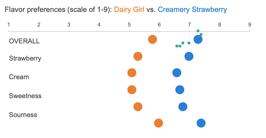
You’ll also want to make sure the FRONT series is positioned at the bottom of the series list. Reorder things if needed.

Change the chart type. Select each of the new series and change the chart type from a scatterplot to a standard horizontal bar chart. Because I cannot visually see both of the series, I’m using the drop-down window in the Format tab to select each series.

Once selected, I can navigate to the Chart Design tab and choose Change Chart Type. The resulting graph looks like the following.

Overlap the bars. Right-click on the bars and choose Format series. You can then adjust how much the bars overlap (from 0% to 100%). The FRONT series (or shorter bar) should be in front now.
A quick side note! We spaced out the original dots using numbers ending in 0.5 (SPACING series), so the bars and dots align perfectly along the vertical axis. If you used whole numbers instead, then the bars will not align behind the dots and you’ll need to adjust your dataset.

Adjust the second horizontal axis (bottom). To align the bars and dots horizontally, you’ll need to make both horizontal axes match. Click on the bottom axis, choose Format Axis and change the range from 0-8 to 1-9. Once aligned, you can delete the bottom axis; I’ve preserved it so you can see the range.

Change the colors of the bars. The final step is to hide the top bar by changing the color to white. I have also adjusted the longer bar to a neutral gray so that the dots continue to stand out. Voila, a connected dot plot!

As stated previously, there are several ways to brute-force a dot plot in Excel—and many other tools for that matter. This is the method that I prefer because it works for both the Cleveland and connected versions. It also works regardless of whether I’m building a horizontal or vertical dot plot. If you have a different approach or suggestion, be sure to let others know via the comments or if you enjoy consuming content via video check out our How to make a dot plot in Excel tutorial. The snippet below talks through an alternative approach to adding category labels.
You may be thinking that this is a lot of effort. You’re not wrong. Custom charts are tedious, but sometimes it’s worth it. That’s why I often advise people to keep things low-tech when determining which graph to use. Sketch your ideas with pen and paper to determine which chart makes sense for your scenario, then figure out how to build it in your tool—Google searches, and a bit of creativity go a long way!
To learn more about tools, check out some of the how-to videos in the community (open to premium only). If you want to practice making dots, feel free to download the attached Excel spreadsheet and experiment independently.