
#SWDchallenge: comedic charts

inspired by Matt Shirley’s creations
Two of my favorite things in this world are humor and data visualization—the latter likely not surprising to anyone reading this challenge. While each of these is enjoyable on its own, when you pair them together, it’s a combination that’s hard to beat.
Matt Shirley’s creations illustrate this power-pairing beautifully. Matt posts a daily chart—usually on Instagram—that captures the humor in everyday life. Take a moment to scan through some of my personal favorites.

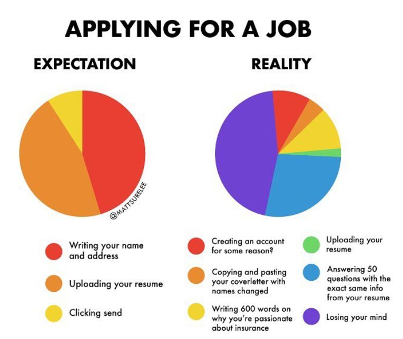
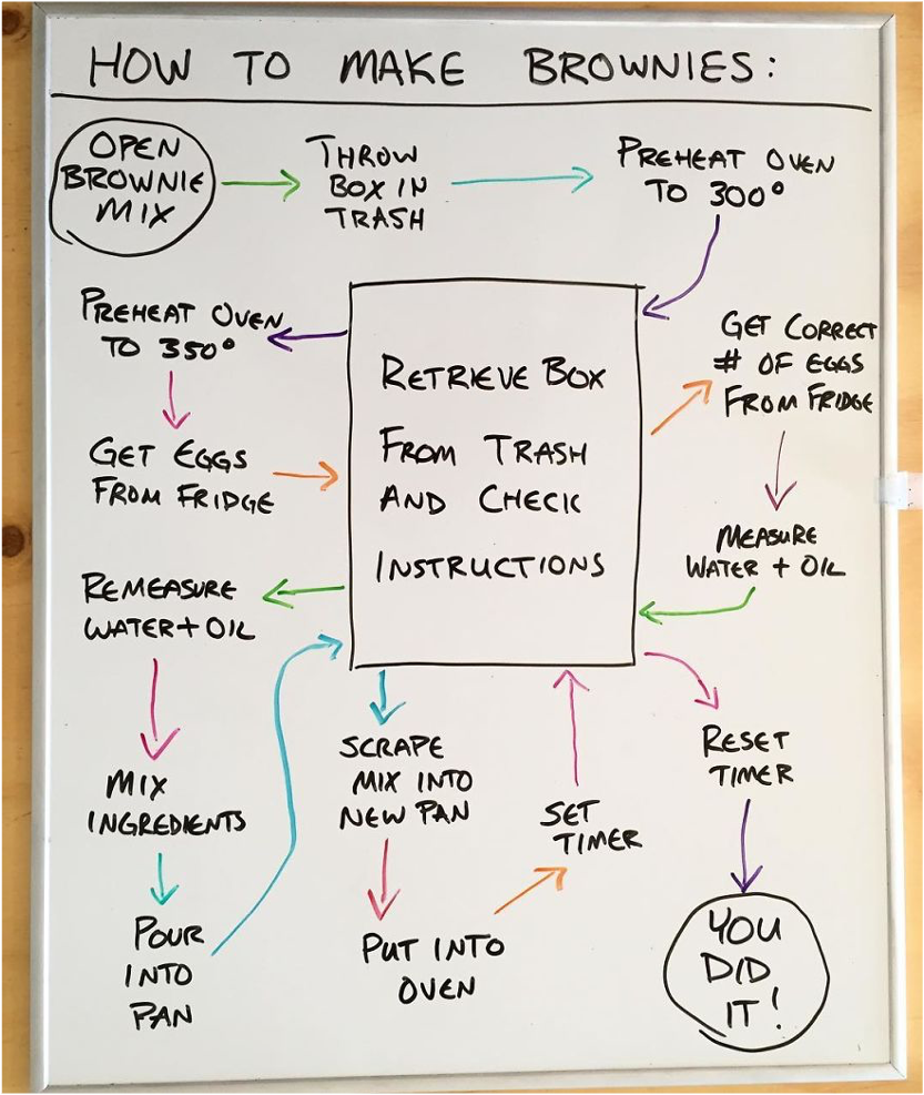
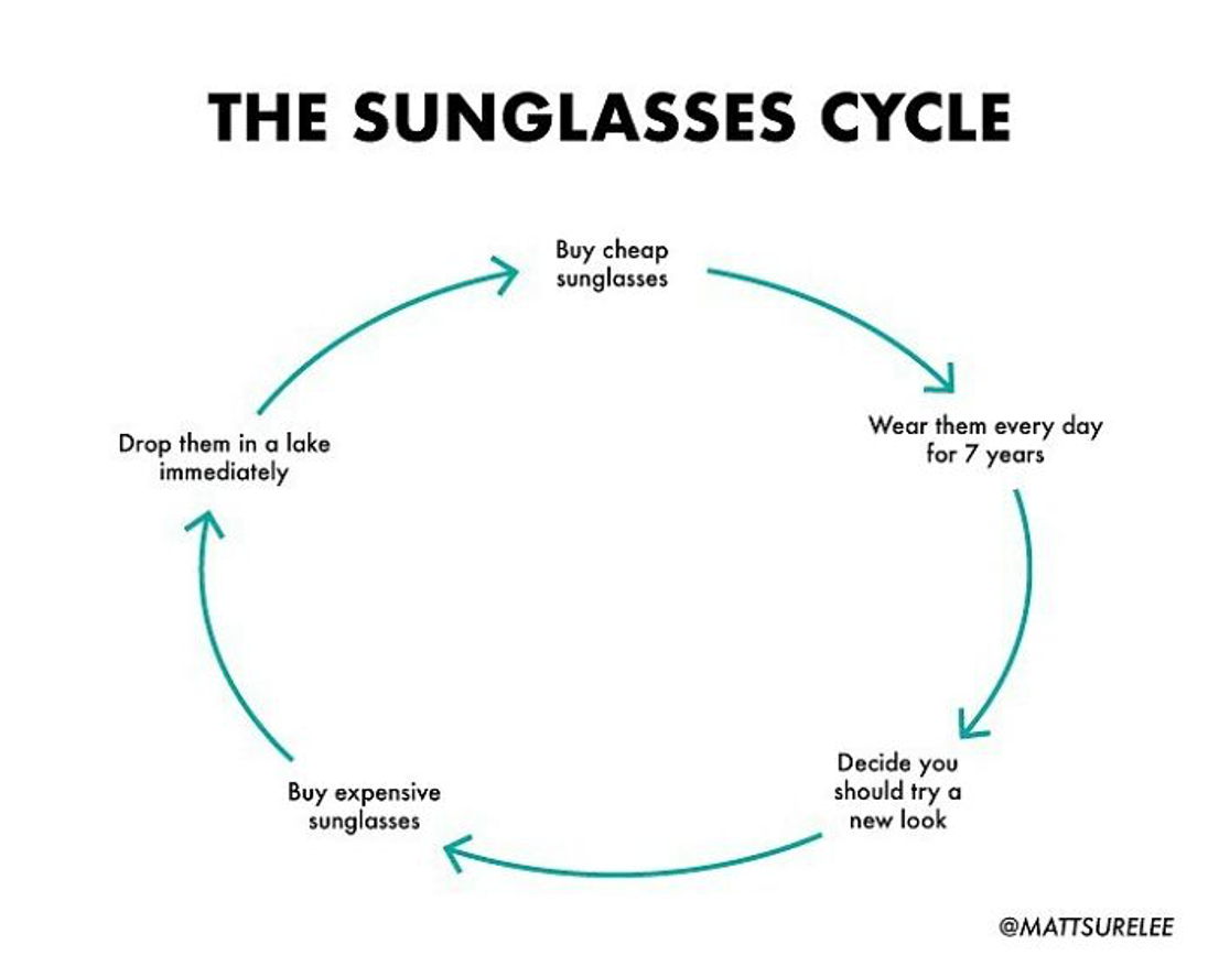

It’s incredible to me how he can communicate a reasonably complex idea or process in such a simple manner.
More importantly, for the purposes of this challenge, there is much we can learn and appreciate from Matt Shirley’s work. He tends to use basic charts and graphs—pie charts, tables, Venn diagrams, and line graphs, to name a few. Short, easy-to-read phrases and clear labeling are ever-present. But most notably, he is communicating qualitative information or processes in an accessible manner.
We’ve hosted a handful of qualitative challenges in the past, but now it’s time for you to have a little fun with it—literally!
The challenge
Think of a process or an idea and create your own comedic chart to explain it. The visual can be hand-drawn or fully-polished off in a tool of your choice. Your focus should be on communicating non-numeric or qualitative information—and having a laugh while you do it.
For inspiration, check out the related resources section below. Share your creation in the SWD community by November 30th at 6:00 PM ET. If there is any specific feedback or input that you would find helpful, include that detail in your commentary.
Related resources
Here are some additional examples for inspiration. This is a starting point, but certainly not a comprehensive list (if there are other great examples you’d like to share, feel free to include links in your submission commentary).