
#SWDchallenge: re-brand it!
It’s April, which means the change of the seasons is underway. If you’re like me, the dawn of spring brings a reinvigorated optimism to my day. Simply changing up one component—the hours of sunlight—totally changes my energy and enthusiasm for tackling life.
The same can be said of the “feel” of our data visualizations. The style of our visuals can lead our audience to experience the data in totally different ways. This month, we’re going to echo our early exploration of the concept of brand intentionally applied—this time with a different example.
First, a few thoughts about how brand can enhance our data visualization:
Branding is important to cohesiveness in an organizational setting. Companies go through great amounts of time and expense to create their brand elements: logos, colors, fonts, templates, and related style guidelines. Incorporating branding considerations into your visualizations adds value—it helps create a cohesive look and feel that infuses personality into your data communications.
Branding can go overboard if it’s not thoughtfully designed. When applying components of a specific brand—font, color, logo, images—it's tempting to go too much into a space we want to avoid (cluttered visuals, too much color, cutesy images and the like). A graph’s primary goal is to convey a message, and we should strive to make that message as accessible as possible via effective chart titles, axis labels and annotations.
Branding done well evokes a feeling—and perhaps an emotional connection—which can help you connect to a specific audience.
Consider the following graph from the last re-branding challenge. The storytelling with data brand has been applied: the font is Arial; the axis and chart titles are upper-left-justified; and most elements are gray (with the exception of the sparing use of brand colors to direct attention).

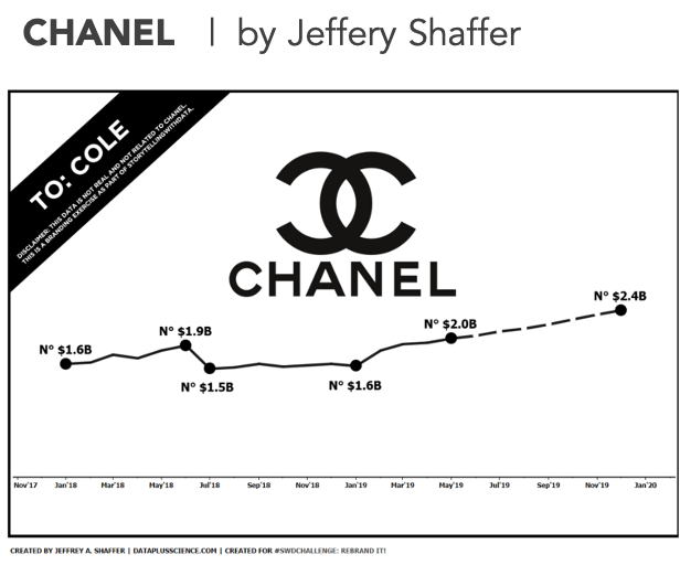
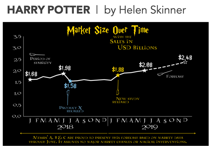
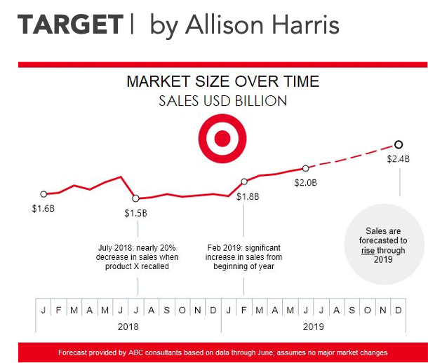
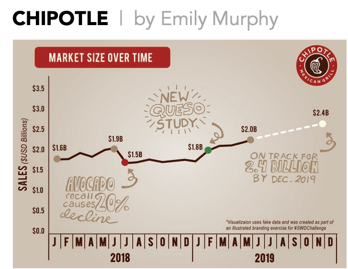
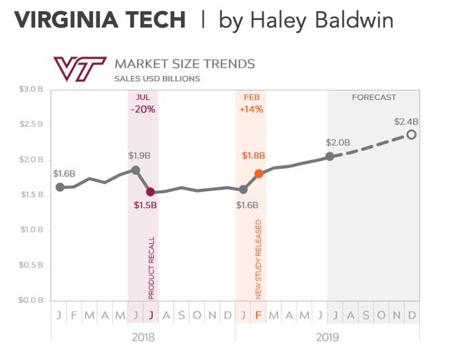
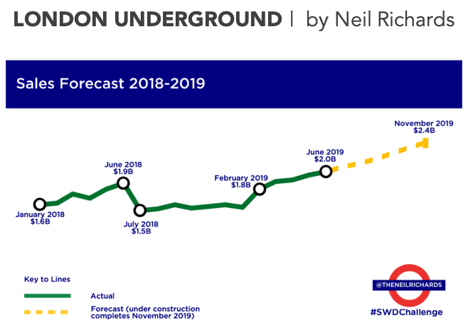
In these submissions from SWD community members, check out how different your reaction to the same data is when a specific brand’s look and feel is applied:
THE CHALLENGE
Your challenge this month is to re-brand the following visual in the style of your choosing. You can download the data and this graph and execute in your preferred tool of choice.

Feel free to take liberties for the purposes of the exercise. Upload your submission and commentary (including the brand and insight into your creative process) in the community by April 30 at 5 PM Eastern.
IMPORTANT: Include the following disclaimer with your re-designed visual:
DISCLAIMER: fake data for illustrative branding exercise for the #SWDchallenge
Go forth and brand it—we are excited to see what you come up with!
RELATED RESOURCES
Here are a few related resources (not a comprehensive list). If you are aware of other good ones, please share in your submission commentary.
SWDchallenge: previous brand challenge and 58 redesigns
Let’s Practice! Exercise 5.4: design in style
Coolors: color palette generator
Canva article: choosing brand colors
Excel eyedropper function: match and transfer colors
Jon Scwahbish: style guide repository