what your audience really wants
Today’s post is a makeover-focused one, based on a graph I recently encountered. I’ll illustrate how to improve this less-than-stellar graph using the entire holistic SWD process taught in the best-selling book:
understanding the context
choosing an effective visual
eliminating clutter
focusing attention strategically
telling a compelling data story
By working through real-world examples, such as the one we’ll talk about today, you can practice applying this process, and become more confident when incorporating similar changes and strategies into your own work.
Consider the following visual from a national retailer, showing warehouse performance. The details have been modified (to protect client confidentiality) but the spirit of the original remains the same.
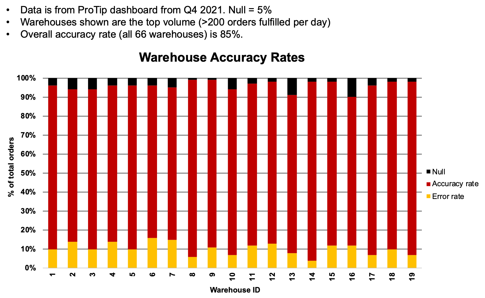
When critiquing someone else’s work—particularly when it’s been removed from its original context as it is here—it’s always helpful to start by assessing what was done well.
Visual choice: I’m familiar with a bar chart, including the specific variation shown here, the 100% stacked bar, so I’m not faced with the hurdle of trying to decide how to decipher an uncommon visual type. With some modifications (which we’ll get into later), this visual type should work well to explain the main message of this communication: the breakdown of performance (accurate vs inaccurate rates) across the warehouses of interest.
Words: I also appreciate the helpful context included at the top of the visual stating the data source, as of date, why this subset of data is shown, and the overall picture of 85% accuracy.
That said, there are many ways we can improve upon this visual to tell a concise and action-inspired data story. I’ll outline the changes I’d recommend and my rationale for each.
the quick hits: declutter, focus and words
A few simple things go a long way without a ton of effort and time. The biggest bangs for your data storytelling buck are typically eliminating clutter, using color intentionally, and clarifying the intended takeaway with words.
I can improve upon the original by making the following changes:
Use a different color palette. There is a positive/negative connotation to this data, so I’ll elect to use blue to signal the positive (accurate) and orange, its complement on the color wheel, to accentuate the negative (errors).
Declutter. The original graph has many elements that make it appear more complicated to process than it really is, like gridlines, harsh bolding, rotated x-axis labels, and an out-of-place legend. I’ll declutter, leaving only those elements that add enough value to make up for their presence.
Use words more effectively. If I want my audience to understand that this data is conveying a success story, I shouldn’t assume that they will come to that conclusion on their own. I’ll not only state it in words, but tie the words to the data they describe using similarity of color.
You can see all of these changes applied in the visual below.

Check out the difference already!

While this is certainly an improvement over the original, we can continue to iterate and develop an even more effective final product.
rotate the graph horizontally
As already mentioned, I like the choice of 100% stacked bar to show the relative percentages. I have two baselines for comparison: with one at the 100% value along the top and one at the 0% value along the bottom, I can be thoughtful about which series to place along these baselines to enable an easier visual comparison.
One change I’d recommend is to rotate to a horizontal orientation, as shown below. I’ve intentionally removed color here to keep the emphasis on the choice of graph. In the case where we had longer category names, this orientation would allow for more space to spell out the entire name without rotating labels. You can read more about horizontal vs vertical bars in this prior post.

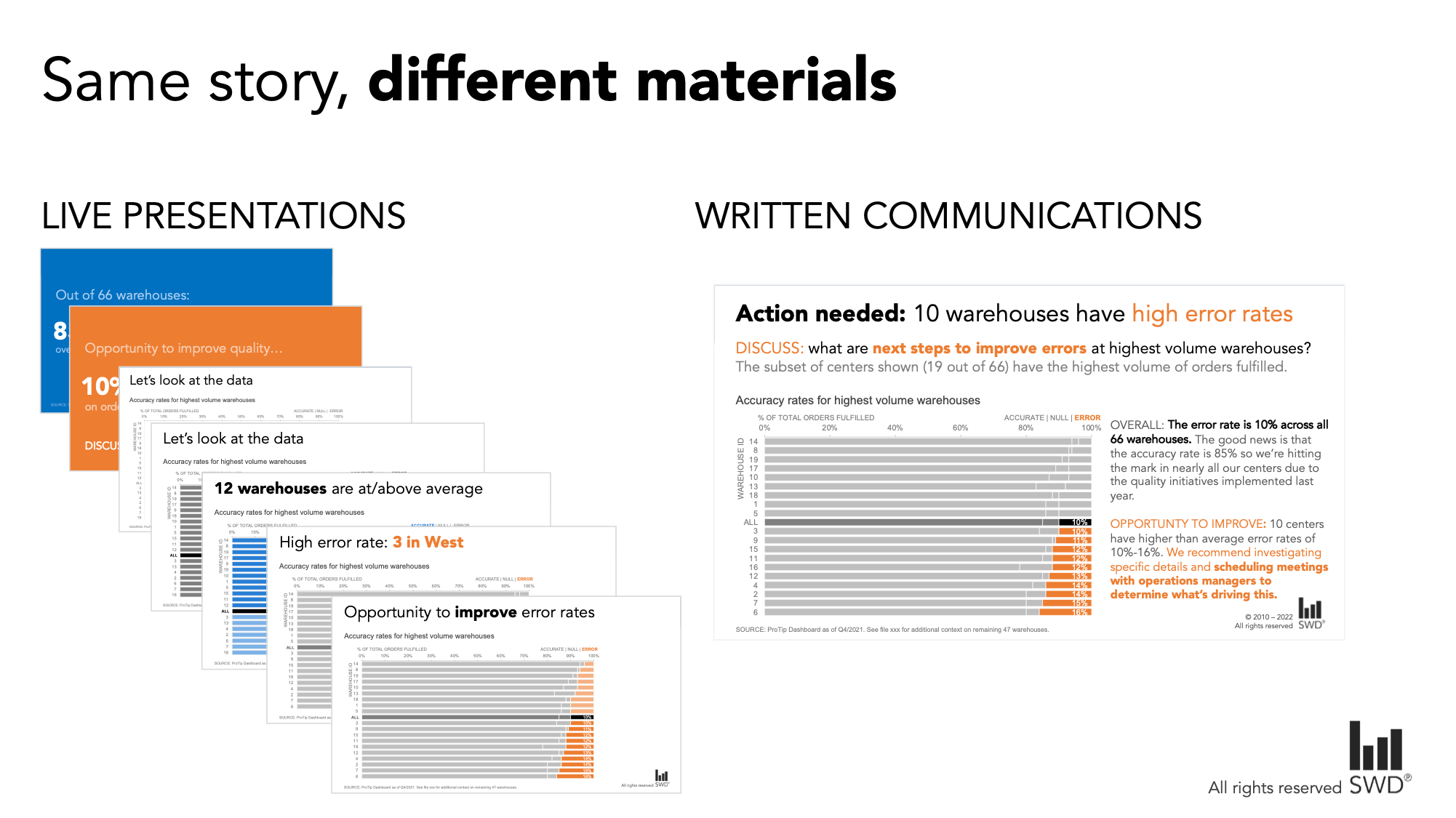
consider how the graph will be consumed
When you’re with your audience—whether virtually or in-person—your graphs and presentation slides can include less context and detail physically written down or shown, because you are there to fill in any blanks. The reverse is true for written communications, where people have a higher tolerance (and perhaps demand) for more detail. This is why live presentations are better suited for sparse slides than written communications.
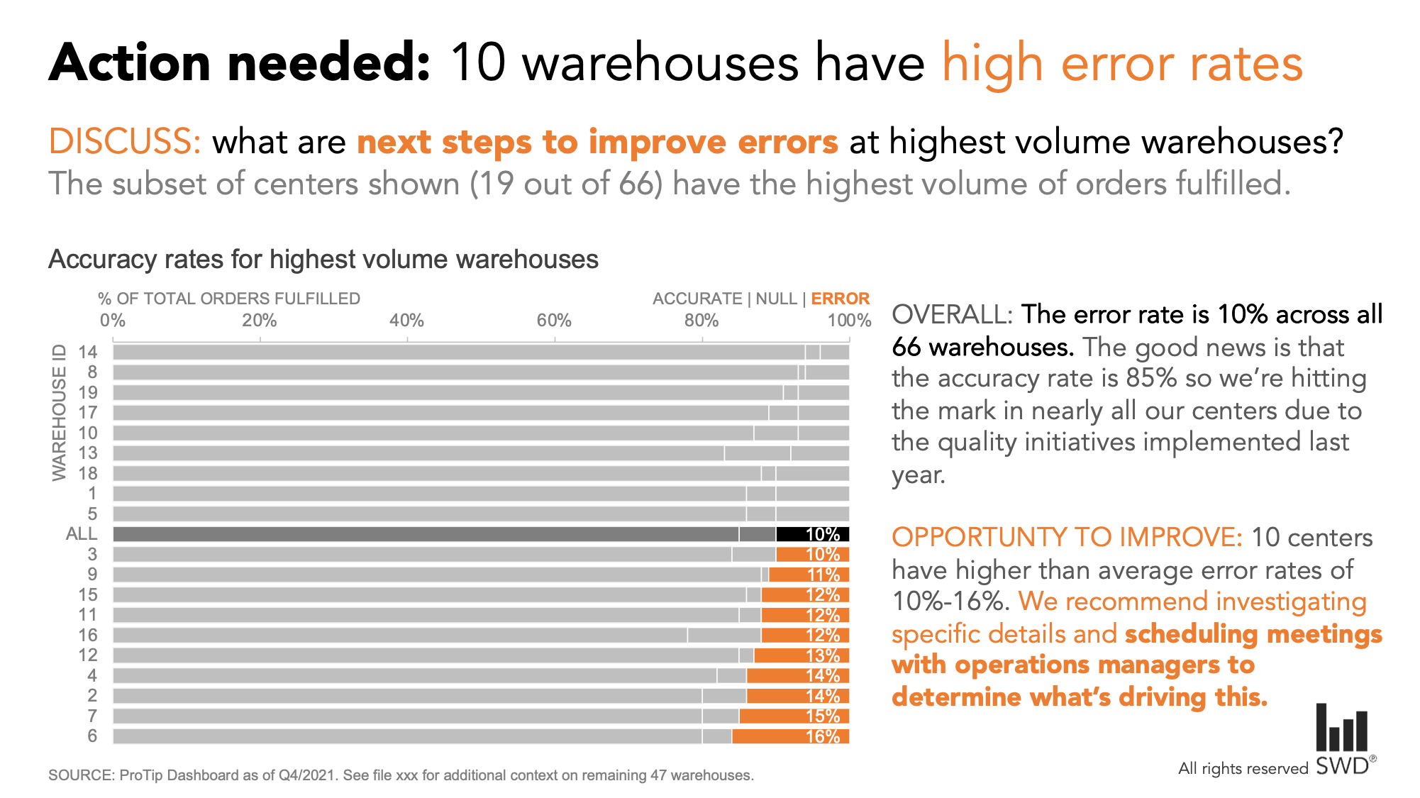
Check out how the same presentation might look different if we were delivering it live with a series of slides, versus sending around a single summarized view for people to read on their own:
Now let’s pull it all together.
don’t just show data, tell a story!
Watch my live presentation—and more discussion on how to build your data storytelling muscle—in the replay from a recent live chat on our YouTube channel:
An effective data story doesn’t just happen. Getting comfortable applying all the components considering the context, choosing a visual type, intentional design and creating a story takes time and practice. But it is worth the effort, because any communication is likely to be more effective when we move beyond simply showing data, and instead take intentional steps to inspire and drive action.
This is what your audience wants from you.

If interested, you can download the data and create your own makeover version in the exercise bring the data to life. For more examples of visual transformations, check out the before-and-afters in our makeover gallery.