declutter a dual y-axis chart
Have you ever felt overwhelmed when you open an overflowing, unorganized closet or enter a crowded room? It’s a common reaction when you receive too much visual input at once. We often experience this same uncomfortable feeling when presented with too much information in a graph.
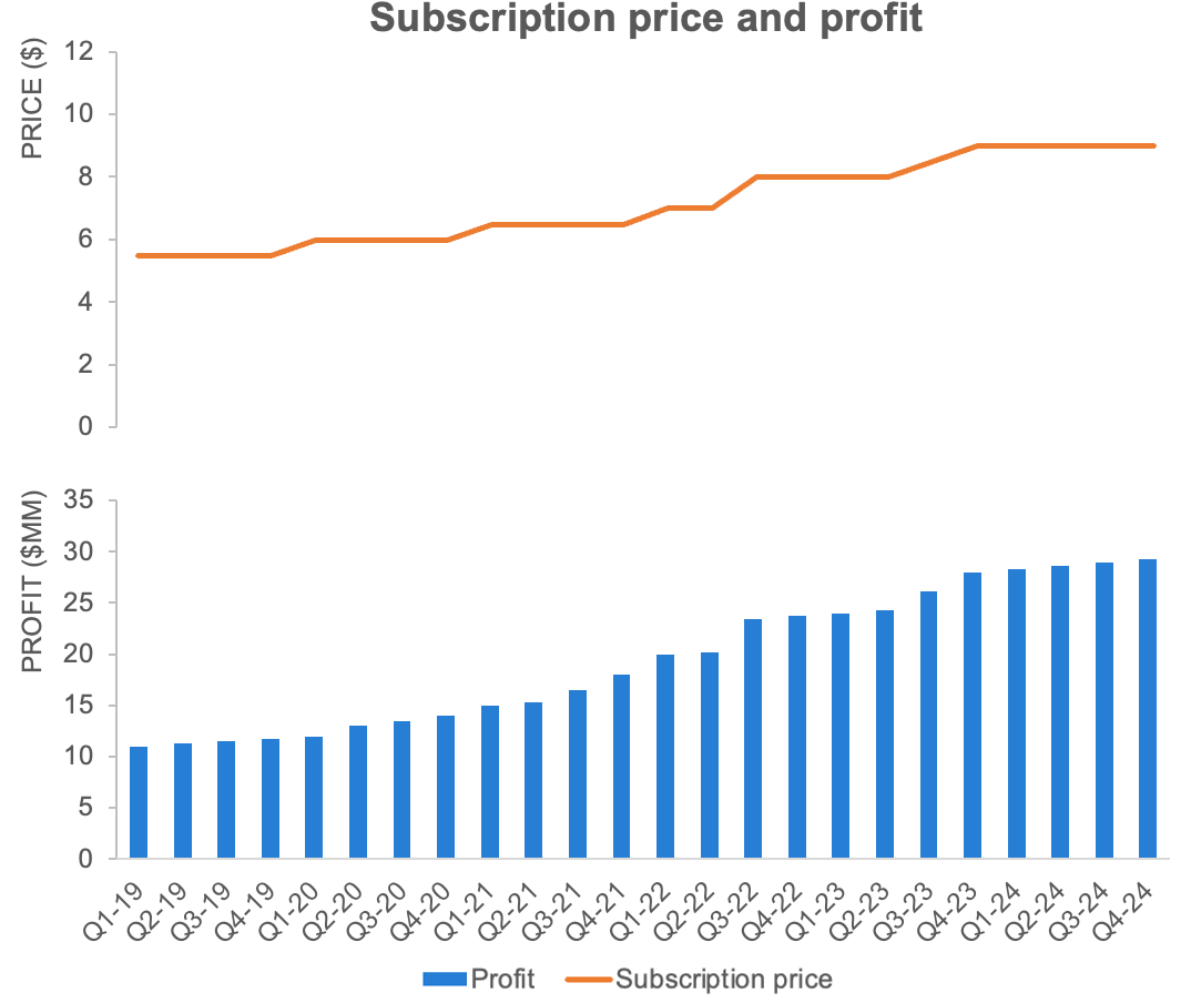
Consider the following dual y-axis chart and take note of how it makes you feel.

An example dual y-axis chart—also referred to as a combination or secondary axis graph.
You may be confused and overwhelmed at first. Dual-axis graphs like this are inherently challenging. Whether you call them dual-axis graphs, combo charts, or secondary y-axis graphs, they always demand extra effort from a reader to figure out which data series to read against which vertical axis.
Explore dual y-axis alternatives
We can eliminate this effort by using one of two alternative approaches:
hide the vertical y-axes and instead label the data directly, or
pull the graphs apart vertically so you can still leverage the same x-axis across both, but each gets its own left-hand y-axis.
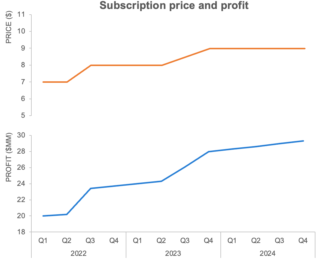
For this example, the second option—separating the charts—is a better approach since the lines are overprinting on the bars.

An alternative to a dual y-axis chart: separate and stack vertically.
Now there are two separate graphs, but they are organized so they still look like a single visual, and the horizontal axis can be read across both. Since they each have their own y-axis on the left-hand side, there’s no more confusion about which scale goes with which data series.
This is a better view than the original chart, but there is more we can do here to make the graph easier to read and understand.
Eliminate non-essential elements
By default, our graphing tool—Excel in this case—has included gridlines and extra decimals. Stripping away these elements that are taking up space but adding zero information value will simplify our visual and allow the data to stand out further. At the same time, let’s add y-axis titles and tick marks to make things more straightforward for the audience.
Removing gridlines and providing clear vertical axis titles along with tick marks for reference make a more clear graph.
Consider how much data is required
We could make the visual easier to digest by plotting less data. For instance, we may not need so much historical data presented on the horizontal axis. Are subscription prices for every quarter in 2019, 2020, and 2021 necessary here? Let’s assume that for our purposes, only the previous year’s (2022) and current year’s (2023) data, along with next year’s (2024) projections are pertinent. Displaying only the relevant data reduces the cognitive effort required to understand the information.
Let’s also take the opportunity to remove the repeating year labels by using super categories, gaining space to rotate the x-axis labels horizontally, making them easier and faster to read.

Show the appropriate amount of historical data—here we are only displaying last year, this year, and next year’s data.
Iterate to a more appropriate chart type
A different chart type could make things easier for our audience. By swapping the profit bars for a line, we go from twelve dense and heavy bars to one simple line, which provides more space to add additional context and annotations for the viewers of the graph. Line graphs also enable us to zoom in on the vertical axis since we no longer need to show the full values of the bars.
Finally, let’s remove the bottom legend since the axis titles clarify what each series represents. (If we were plotting multiple series against each axes, we could label the lines directly instead.)
Consider lines instead of bars for time series data.
Clearly title the graph
So far, we’ve talked mostly about what we can remove from graphs for clarity’s sake. We also want to be thoughtful about including necessary details so our audience understands what they are looking at. Crafting a clear chart title helps them avoid confusion and faulty assumptions. While adjusting the title, switching from title case to sentence case makes it faster to read and left-aligning the text creates a nice framing for the graph.
A title cased and left-aligned chart title is easier to read.
Differentiate forecast from actual
Our graph includes future data: the remainder of this year (Q3 and Q4 2023) and next year’s (2024) data. This information represents a forecast of what is expected to happen. This should be clearly differentiated from actual data so people looking at the chart do not come to the wrong conclusion. Using dotted lines, a vertical reference line, or a shaded region like below are effective approaches.

A shaded region can help to differentiate actual from projected data.
Focus attention
Now our graph is much simpler and clearer than the original dual-axis view, but you may be left wondering why you are looking at this information. We can go further and add details to make our point evident to our audience. With sparing use of color, words, and other design choices, we can show where to look and make the main takeaway clear.

Use words and color sparing to make the main takeaway obvious.
Minor changes have a major impact
Check out the impact of our deliberate steps to simplify the original dual y-axis graph. Each change by itself was relatively minor, but when applied together the final view is less overwhelming and easier to understand.

Intentional design steps to declutter and focus are proven to be clearer and more credible while increasing recall. For more practice, watch our step-by-step Excel declutter video and tackle a decluttering exercise.