alternatives to pies
My disdain for pie charts is well documented. While opinions on their usefulness run the gamut, I am certainly not alone in my contempt. In my workshops, I sometimes get the question, "In what situation would you recommend a pie chart?" For me, the answer is never.* There are a number of alternatives, each with their own benefits. It's these alternatives that I'll focus on in this post.
*Full disclosure: There was once a situation at Google where we wanted to share some diversity stats on gender breakdown but didn't want to show the specific values. In this case, the fact that it's tough for people to attribute accurate value to 2-dimensional space worked to our advantage and we leveraged a pie chart absent of any value labels. Though, now that Google is sharing their diversity stats publicly (I'll resist the urge to comment on the ill-chosen donut graphs they are using to do so) it seems even this has become a moot need.
The following is an example that I often use in my workshops (based on a real example, but modified a bit to preserve confidentiality). By way of context: imagine you just completed a pilot summer learning program on science aimed at improving perceptions of the field among 2nd and 3rd grade elementary children. You conducted a survey going into the program and at the end of the program and have visualized the resulting data in the following set of graphs.

I believe the above data demonstrates that, on the basis of improved sentiment towards science, the pilot program was a great success. Going into the program, the biggest segment of students (40%, the green slice in the left pie) felt just "OK" about science - perhaps they hadn't made up their minds one way or the other. Whereas after the program (pie on the right), that 40% in green shrinks down to 14%. Bored (blue) and Not great (red) went up a percentage point each, but the majority of the change was in a positive direction: after the program, nearly 70% of kids (purple + teal segments) expressed some level of interest towards science.
The above visual does this story a great disservice. Yes, you can get there, but you have to first overcome the annoyance of trying to compare slices across two pies. There's no need for this annoyance: choose a different type of visual!
Let's take a look at four alternatives using the above data.
Alternative #1: Show the Number(s) Directly
If the improvement in positive sentiment is the big thing we want to communicate, we can consider making that the only thing we communicate:

Too often, we think we have to include all of the data and overlook the simplicity and power of communicating with just one or two numbers directly, as in the above. That said, if you feel you need to show more, look to one of the following alternatives.
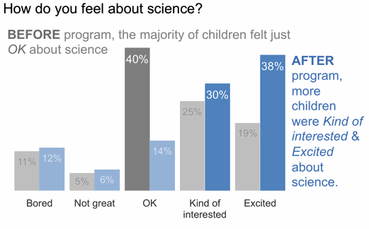
Alternative #2: Simple Bar Graph
When you want to compare two things, you typically want to put those two things as close together as possible and align them along a common baseline to make this comparison easy. The simple bar graph does this. This is the "after" version that I typically use in my workshops (which is why you see more narrative integrated into the following visual than the other alternatives).
Alternative #3: 100% Stacked Horizontal Bar Graph
When the part-to-whole concept is a must-have (something you don't get with either of the above solutions), the stacked 100% horizontal bar graph achieves this. Note that you get a consistent baseline to use for comparison both at the left and at the right of the graph, which can be useful in cases such as this, allowing the audience to easily compare both the negative segments at the left and the positive segments at the right across the two bars. Because of this, I find this to be a useful way to visualize survey data in general.

In the above version I chose to retain the x-axis labels rather than put data labels on the bars directly. I tend to do it this way when leveraging 100% stacked bars so that you can use the scale at the top to read either from left to right (which in this case allows us to attribute numbers to the change from Before to After on the negative end of the scale) or from right to left (to do the same for the positive end of the scale). In the simple bar graph shown previously, I chose to omit the axis and label the bars directly. This illustrates how different views of your data may lead you to different design choices. Always think about how you want your audience to use the graph and make your design choices accordingly - different choices will make sense in different situations.
Alternative #4: Slopegraph
The final alternative we'll consider today is a slopegraph (I've blogged about slopegraphs previously here, here, and here). As was the case with the simple bar chart, you don't get a clear sense of there being a whole and thus pieces-of-a-whole in this view (in the way that you do with the initial pie, or with the 100% horizontal stacked bar). Also, if it is important to have your categories ordered in a certain way, a slopegraph won't always be ideal since the various categories are placed according to the respective data values (in the following, on the right hand side, you do get the positive end of the scale at the top but note that Bored and Not great at the bottom are switched relative to how they'd appear in an ordinal scale because of the values that correspond with this points - if you need to dictate the category order, use the simple bar graph or the 100% stacked bar graph where you can control this).

One thing you do get with the slopegraph is the visual percent change from Before to After for each category via the slope of the respective line. It's easy to see quickly that the category that increased the most was Excited (and the category that decreased markedly was OK). The slopegraph also provides clear visual ordering of categories from greatest to least (via their respective points in space from top to bottom on the left and on the right sides of the graph).
Any of these alternatives might be the best choice given the specific situation, how you want your audience to interact with the information, and what point(s) of emphasis you want to make. The meta-lesson here is that you have a number of of alternatives to pies that can be more effective for getting your point across.
I should note that I had a couple specific sources of inspiration for this post. I recently completed some long overdue reading that included Jon Schwabish's An Economist's Guide to Visualizing Data. In it, Jon discusses a number of data viz best practices through examples of common mistakes and some nice makeovers, including a section focused on alternatives to pies. I highly recommend checking out this paper. Andy Kriebel recently posted a nice makeover of a particularly annoying "data visualization" that tried to combine pie graphs with faces (you have to see it to believe it). There are a few things that are worse than a pie graph: a 3D exploding pie graph, having to compare segments across two pie graphs, and - a recent (and unexpected) addition to the list - the face-pie.
The Excel workbook with the above makeovers can be downloaded here.
Are there other alternatives to pies that should be added to this list? Which one do you favor in this situation? Leave a comment with your thoughts!