how to improve a line chart in Excel
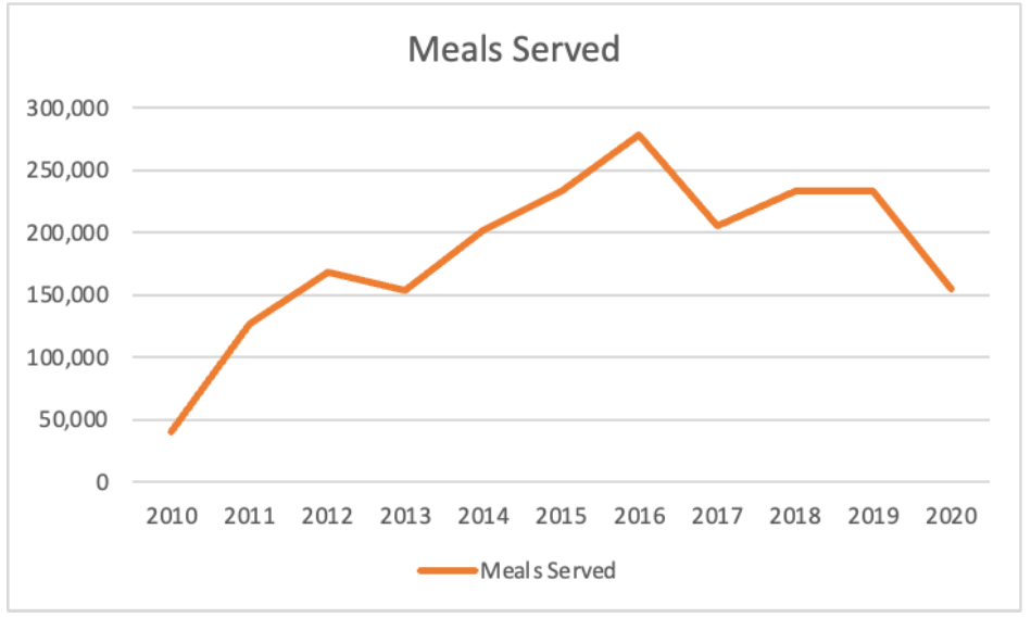
In a recent post, we shared how to create an Excel line chart, ending with the line chart below. This article builds upon this graph and covers simple design changes to the Excel defaults that will make it quicker and easier for our audience to understand the data.
Formatting adjustments
Excel built-in charts typically have borders, gridlines, and color legends—things that can make it harder for our audience to get at the data.
Declutter
First, let’s focus on removing the elements that are taking up space but not adding informative value, like the chart border. Often, we use a border to differentiate parts of our slide or visual. In most cases, we can remove the chart border and use white space to better set them apart.
Removing the horizontal gridlines introduces additional contrast that allows the line to stand out more. Right-click on the gridlines and then select delete in the menu to achieve this. These two little changes simplify the graph and make it easier to see the data.
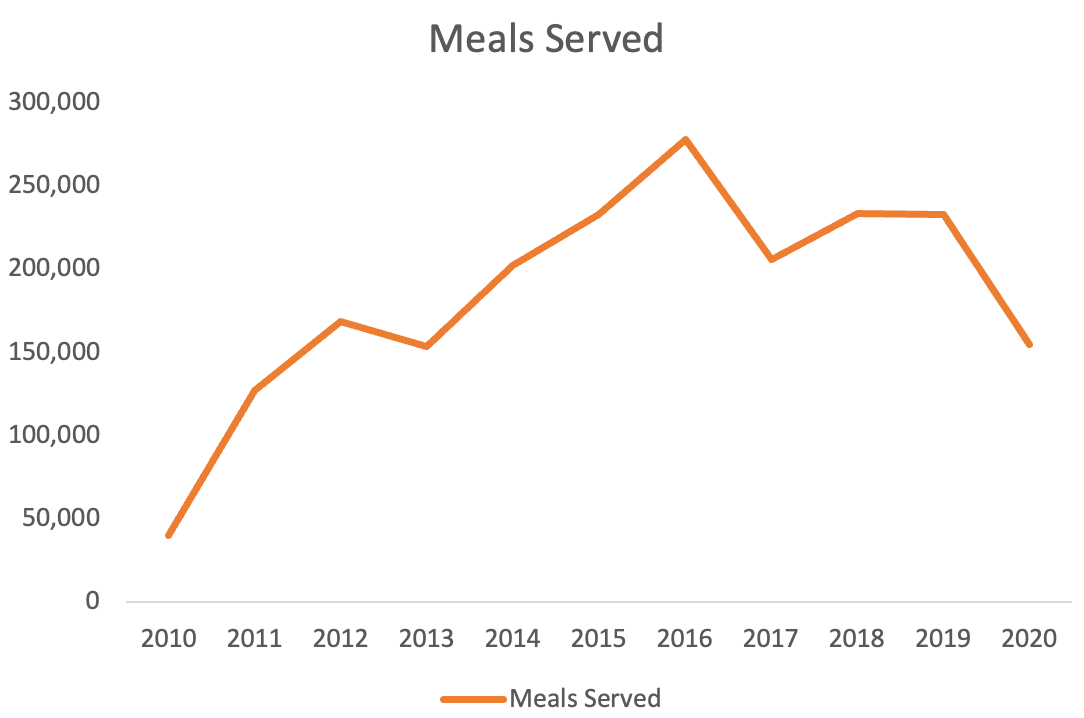
Next, we can adjust the thickness and the color of the line to something that will provide more emphasis and make the data stand out further. Right-click anywhere on the line and go to Format Data Series… in the menu. A formatting window will appear on the right of your screen. Navigate to the paint can icon on the upper left, then choose ‘Solid line’ and adjust the color to a dark grey. Just below this, we have the option to adjust the width of the line to something thicker—let’s go with 3 pt here.

After changing the line color and width, here is the chart we have:

Another change we can make is to adjust the y-axis number format to reduce the number of zeros that appear. Right-click on the y-axis, then choose Format Axis… from the menu. A format window will again appear on the right-hand side of your screen. Select the bar icon on the upper right to change the ‘Display units’ drop-down menu to Thousands.
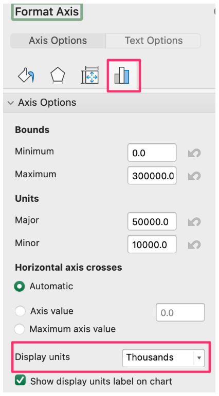
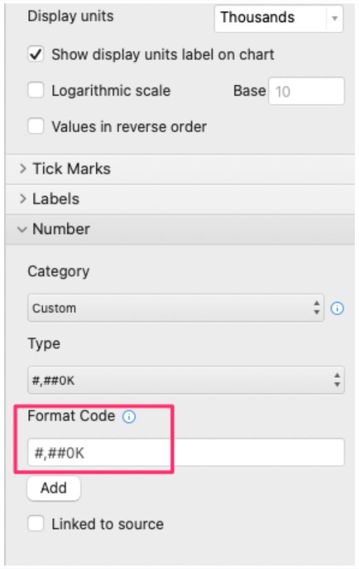
At the very bottom of the formatting pane, under ‘Number’, let’s add a ‘K’ to the end of the ‘Format Code’ field to signify the y-axis numbers are in thousands—this also allows us to replace the axis title with ‘Meals served’, instead of the ‘Thousands’ title Excel automatically added.
While we are formatting the y-axis, let’s also add an axis line and tick marks to provide an anchor. Expand the ‘Tick Marks’ menu and select ‘Outside’ from the ‘Minor type’ drop-down menu. Let’s also add tick marks to the x-axis and align the tick marks with the data points on the line by choosing ‘On tick marks’ under the ‘Axis position’ option. The added tick marks maintain the cleanliness of the graph while bringing back a visual connection between the axis and the data that was lost when we removed the gridlines.

Here is what the axis formatting changes look like:

Finally, let’s reduce the amount of effort it takes to look back and forth from the legend to the line. There are a couple of options for this. One is to move the legend to the top of the graph as a subheader so the audience reads it before they get to the chart. Another option is to label the line directly. However, in this scenario, we’ll remove the legend altogether because we only have a single line and the axis title already explains what the data is.

We’ve identified and eliminated some items that were not necessary to our visual, making a more simplified view. To avoid having to make formatting changes, over and over again, you can use a clean slate template to build your graphs.
Provide additional context
Our chart is now looking considerably better, but we can do more to improve upon it. There are some items to add to our line chart to provide our audience with an additional understanding of what they are looking at.
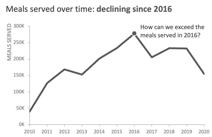
First, let’s craft a clearer title. The data is the only context we have for this example, so let’s use it to make some assumptions about why our audience may care about the information. Meals served peaked in 2016 and since then the trend has declined. Our title could prompt the audience to ask how to return to the donation levels and meals served during the best fundraising year.
To make changes to the title, click on the existing title twice and type your preferred words. For example, “Meals served over time: declining since 2016” could be a title for the chart. Now, select the new title and drag it to the upper left corner to create a visual frame around the graph. Putting the title in the top left also ensures that a viewer sees that important context as they begin to read the chart.
Finally, we can add data markers and text annotations to emphasize key points. Since the chart title calls out 2016, we can add a data marker for that year to draw the audience’s attention to that point. Double-click on the 2016 data point so it is the only one highlighted, then right-click and go to ‘Format Data Point’. Under the Marker Options, pick the circle from the Type drop-down and increase the size to 8. Additionally, let’s add a 1 pt white border around the data markers to make it stand out from the line.

Now we have an elegant line chart showing us that meals served have been declining since 2016. We can take it a step further and tell our audience what they should do with this information. For example, we could Insert a text box next to the 2016 data point to spark a conversation about how to reverse this trend.
To continue learning with this example, see how Cole tells a story with this dataset in the how to become a data viz superstar video.
More Excel how-to’s
For more tactical Excel instructions, check out these other resources:
To focus attention, emphasize a data point
To make your graph easy to understand, edit the legend
To create a frame of reference, embed a vertical line
To depict a range of values, add a shaded band
To fine-tune your formatting, adjust bar width
To have cleaner alignment, put graph elements directly in cells
To have more control over data label formatting, embed labels into your graphs