
what clutter can we eliminate?
Final days to register for the May 5th in-person *storytelling & presenting data* masterclass in Chicago! Join Cole and the SWD team for our last in-person public workshop of the year for a magical & energizing day of learning & practicing telling stories with data.
Clutter is exhausting. We typically think of clutter as the accumulation of “stuff” in our homes—our closets, our attics, our garages, under sinks, the storage area that was once a dining room table, the alleged “to donate” pile, etc. While most of it served a useful purpose at one time, those days are now a distant memory.
This has been top of mind lately, as I’ve been preparing to move to a new house. This has prompted some insightful conversations between my husband and me about why we’re compelled to hold onto things. For example, I found a box of outdated operating systems CD-ROMS, many of which I’d had since college. While I agonized over tossing something that I’d held onto for all this time, my husband simply asked, “Under what circumstances do you think you’ll want to reinstall Windows XP on any device you currently own?” Point made.
Why is clutter so hard for us to let go of? Perhaps because we think something has always been there, so it must belong there and we’re afraid of what might happen if we eliminate it. Or perhaps we don’t have a good framework for evaluating whether something is useful or not.
This same concept applies to our graphs and business communications. We tend to blindly accept the default settings of our tools and very rarely consider if the included elements actually have a purpose. The “Windows XP” question, in this case, is: does this element add enough informative value to make up for its presence?”
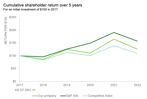
For example, consider the following chart and take note of your process as you intake the data.

If you’re like me, your eyes are probably drawn first to the three lines. Then I jumped down to the data table at the bottom, looking for a legend. Once I found it, my eyes were pulled to the right into the data table. Then I started going back and forth between the data table and the graph, trying to tie specific numbers to the individual data markers. It was only then that I realized I didn’t fully understand how to interpret the metric that was being graphed, so I went back to the top and looked to the chart title and subheader for context. That’s a lot of work!
We’ve written previously about the measurable benefits of reducing clutter, so let’s turn now to the nitty-gritty of making this graph more effective. What elements are not essential? What could be stripped away allowing the data to stand out more? What other changes might you recommend? The following progression shows how I’d declutter:
STEP 1: remove heavy borders and gridlines

STEP 2: eliminate data markers

STEP 3: remove the redundant data table. For considerations on its usefulness, check out this practice exercise. I’ll also take the opportunity here to add explicit labels on the x and y axes.

STEP 4: improve the chart title. I’ll align it to start at the top of the vertical y-axis (rather than it hanging out in space in the center) and decrease the size of the font in the subheader. I’ll also not leave the audience questioning how to interpret the data but specifying that this is a cumulative measure—context that was not originally displayed.
STEP 5: move the legend closer to the data

STEP 6: tie the labels to the data using the same color

Check out the impact of all these changes:

There’s more we can do to improve this graph, including showing our audience where to look through sparing use of color, words and other design choices. But simply reducing the nonessential elements in our visuals means they are more likely to be used—unlike my CD-ROM of Windows XP, which is currently in my recycling can.
For more on decluttering, check out strip away the nonessential and some Excel tactical steps. Get hands-on practice with the community exercise declutter!