
Data storytelling examples & chart makeovers
Any data visualization tool can create a graph—but it doesn’t know your data, stakeholders, and organization like you do. We invite you to explore the following storytelling with data examples for tips on how to bring data to life!

Make the point clear
When you fail to explicitly state the purpose of your communication, you run the risk of the important insight being lost, or someone arriving at the wrong conclusion. When you explicitly include your takeaways and your recommendations in your slides, your audience doesn’t have to guess what they’re seeing. When words and pictures support one another, it is an extremely powerful combination—not only to increase understanding, but also to elevate the likelihood that your audience will remember, and be able to recall, the message you deliver.

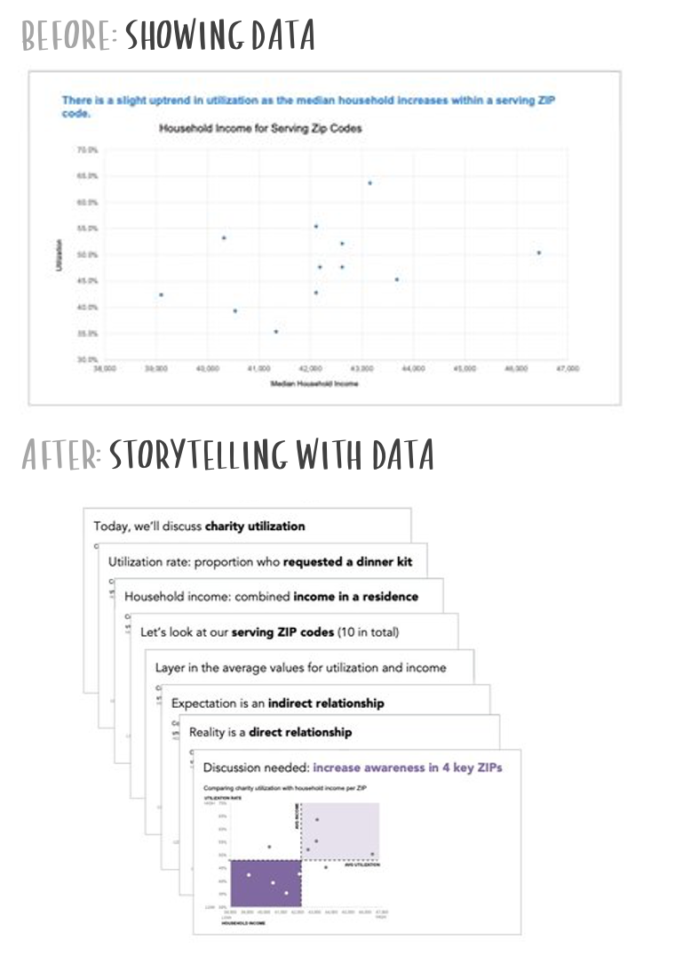
Don't hide the crucial findings
Critical information present in the graphs may not be easily retrievable to us, or our audience. By choosing a more appropriate visual and taking steps to call attention to this information, that important finding can be successfully highlighted.

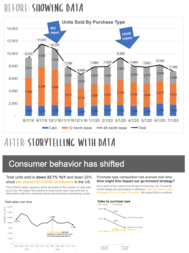
Tackle the challenge of scope creep
“Scope creep” affects almost every organization and while nobody sets out to make a confusing communication, visuals with multiple additions from the original will, by the time you encounter it for the first time, be thoroughly impenetrable. Tackle this challenge and bring back overly ambitious and complex slides back to a level of usefulness and clarity for everyone.

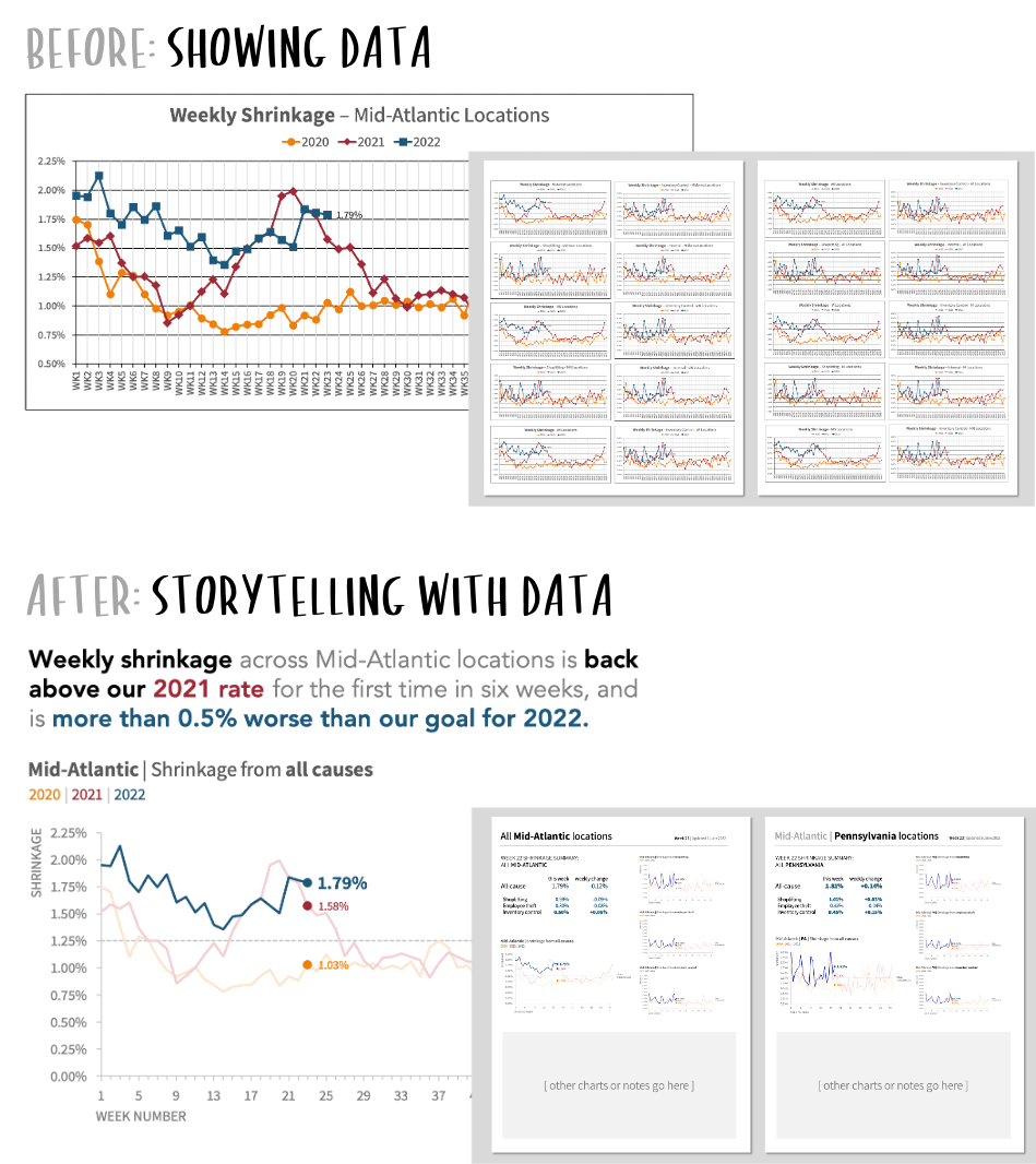
Transform dashboard insights into an action-inspiring story.
Dashboard interactivity makes data discovery much easier, but to drive meaningful change, it is usually more effective to craft a separate presentation specific to the story we want to tell. Creating a presentation tailored to our audience lets us deliver our findings in a way that will resonate with them and frees us from having to compete for attention with unrelated charts, filters, and text.

The same techniques that work on a single graph can be applied more broadly to larger publications.
Strengthening a communication can happen at multiple levels. Depending on your needs, your availability, and the intended use of the end product, you may find yourself focusing on small details in a single visual, the overall structure of the larger document, or a little of both.
Arrange intuitively and emphasize thoughtfully.
You can help your audience understand the key takeaways more quickly and easily by considering how you arrange and emphasize your data. In this transformation, we take intentional steps to understand the context, reduce the effort to interpret the graph, arrange information intuitively, and emphasize data thoughtfully.
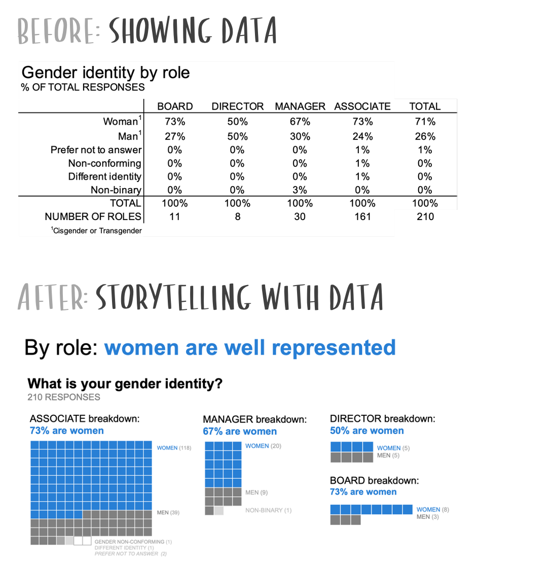
Graphs—if well designed— get the point across faster than tables.
Tables are fine to lookup numeric values, or if your audience desires a level of specificity with the data. If your data has an overarching message, then think about graphing it instead. See how a square area chart was more effective at visualizing this organization’s identity survey.
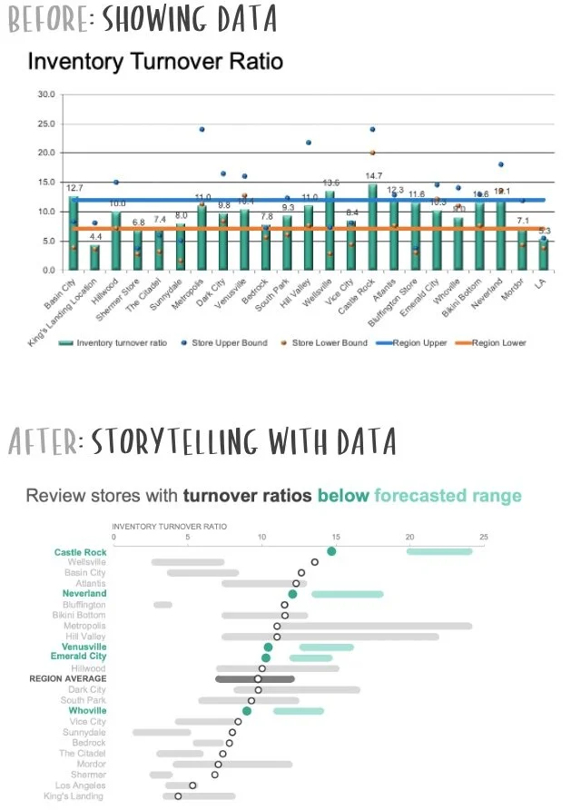
Resist the urge to pack everything into one graph.
When we attempt to answer too many questions in a single visual, we don’t answer any single one as effectively as we could if we break things up into separate graphs. Read how using multiple graphs, tying the text visually to the data, and developing a narrative for both a live presentation and leave-behind took this banking example to the next level.

Distinguish between insights and a call to action.
We sometimes make graphs that simply highlight a takeaway. However, when we step back and think about what story the data tells—is it a success or a call to action?—it can reveal new ways to visualize the data that will help your audience understand something new. This pharmaceutical example illustrates the transition from showing data to answering a question in a way that leads to better insight.

Design with the audience’s end-goal in mind.
When shifting between exploring data and explaining data, ask yourself why am I communicating with data in the first place? Asking yourself these five questions will improve your value as a data communicator in your organization.
Trends are easier to spot in graphs than in tables.
We can make things easier for our audience by visualizing time series data in line graphs. Audience needs may further dictate additional design choices, as outlined in this article.

Short on time? Prioritize audience, words, and graph choice.
Time constraints are real. Read how in just one hour, you can plan, create and deliver a presentation that resonates.
Connect the dots so the audience knows how elements are related.
When showing what could be viewed as disparate data—but isn't—design thoughtfully so your audience doesn’t have to work hard to understand. In this project management example, choosing more effective visuals, active titling and using color strategically made the associations between the different parts of the data and story more apparent.

Use graphs that are easy to read.
While there are countless ways to visualize data, it’s a handful of recognizable charts that will typically get our point across in an effective way. When we stick with familiar data visualizations, our audiences can more quickly decipher, understand, and act upon the data! Learn why a simple bar chart was wildly more effective in this retail example.


You are welcome to use these resources to learn or teach with proper attribution:
Knaflic, Cole. storytellingwithdata.com. © 2025
To organize a storytelling with data workshop for your team, fill out this form. Or, for more resources and ways to train your data storytelling muscles, join the SWD community.