how do i avoid reworking my entire presentation if i have to share slides?

Through virtual and in-person workshops around the globe, we have taught tens of thousands of people how to communicate effectively with data. This series captures some of the noteworthy questions we hear during those sessions—and our answers.

Often a graph that makes sense during a live presentation loses meaning when distributed as a PowerPoint later. How can we retain context when transitioning between audiences without having to rework the entire presentation?

This is a relevant question in the time constraints we constantly are under in a real organization. We want to avoid using so-called slideuments in live presentations because it is difficult to both listen to a presenter and read text-heavy slides at the same time.  

But if you’re crunched for time, there are a few time-saving strategies that will help you avoid having to create a completely separate deliverable.

Let’s illustrate with a business example. Take a few minutes to watch Cole deliver a live data story (starting at 6:08): 

This presentation was notable because:

  •  The slides were well-designed, with effective graph choices, minimal clutter, and smart use of pre-attentive attributes to focus attention.

  • The visuals were paired with a strong narrative. 

If you flip through the same slides on your own—would the story still be as clear? Likely not.

Back to the original question: if we must send out the entire slide deck, then let’s look at two ways we could retain Cole’s narrative without having to rework the entire presentation.

  1. Write active slide titles. When you’re not presenting live, strong takeaway titles on your slides make it easy for the reader to understand the main point. The title bar is usually the first place your audience looks when consuming a slide deck on their own. Order your slides logically so that the reader can read just consecutive slide titles to get the overarching story you want to communicate. This is called horizontal logic.

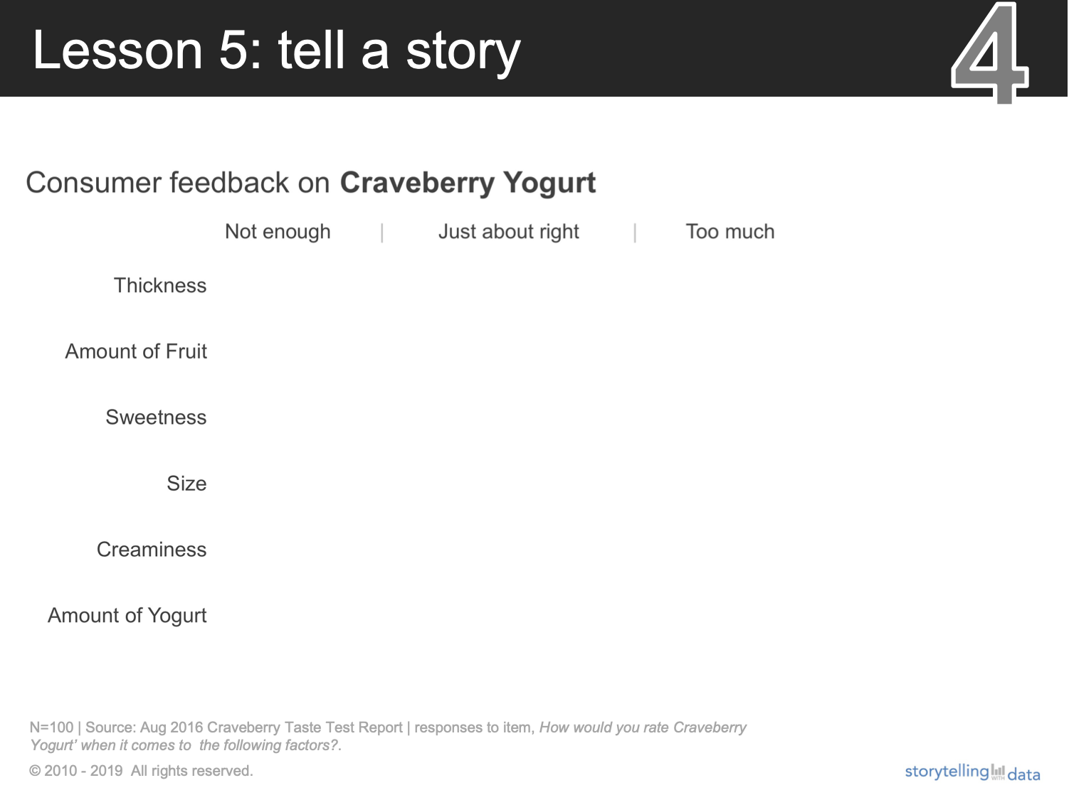
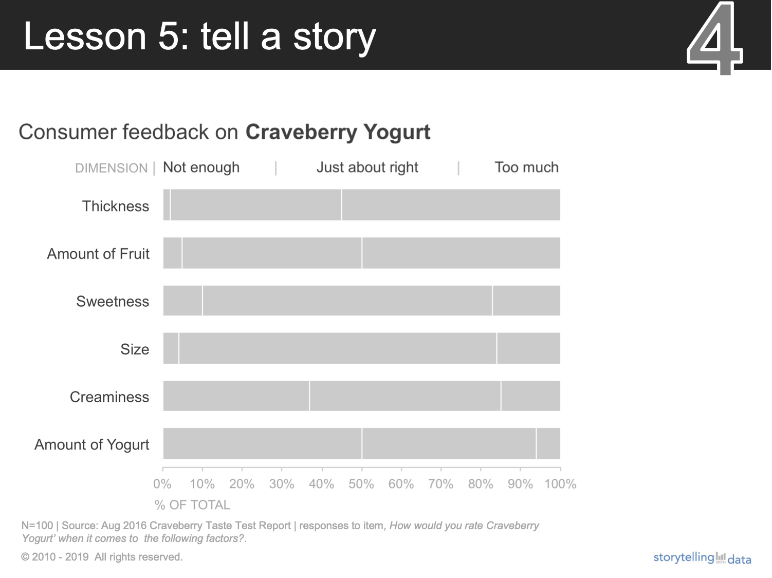
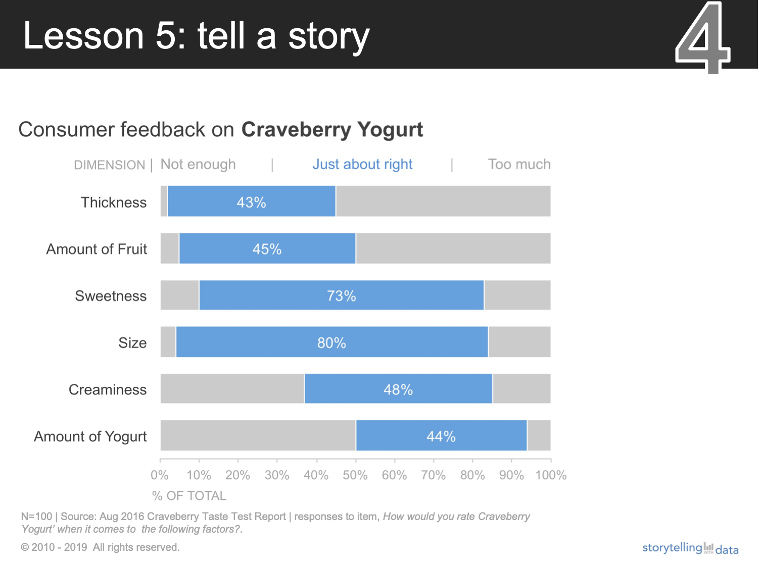
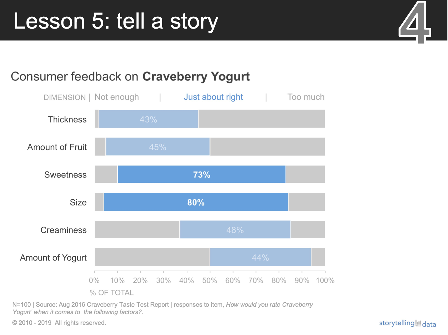
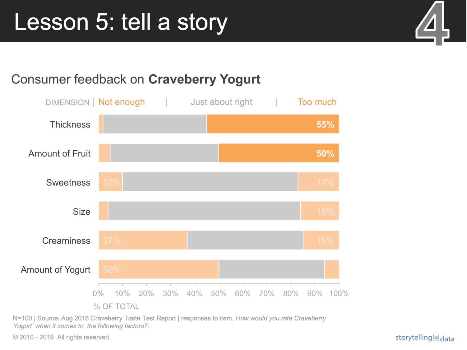
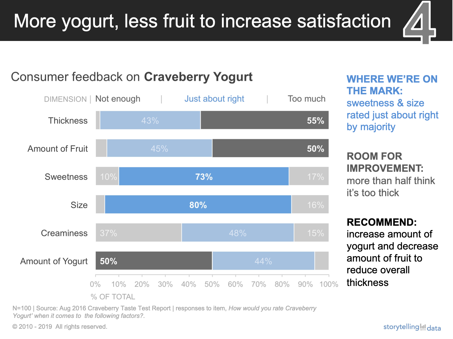
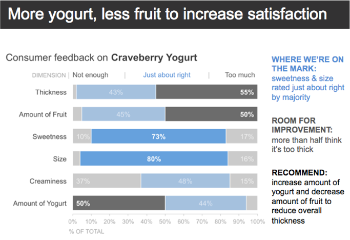
  2. Add a fully annotated summary slide at the beginning of the deck. In this Craveberry video, Cole created this single summarized slide for the product that gets sent around after the meeting, as shown below. The audience gets the salient information without having to hear a live presenter or having to flip through the deck, because all of the information on the slide is self-reinforcing (an example of vertical logic). Adding it at the beginning means the audience could obtain the relevant details without having to flip through all the slides.

data storytelling and data visualization example

Here’s another example of adapting a live progression for written consumption.  

Employing either of these two approaches goes a long way in effective data storytelling because they allow us to tailor our mode of delivery to how our audiences are consuming it. 


Build your data storytelling skills in the community with these related exercises:
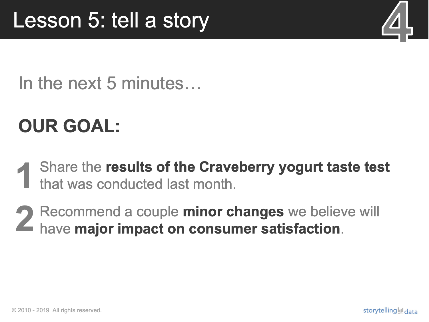
exploring data is different than explaining data

Today’s topic was inspired by a discussion in a recent client workshop. At the beginning of our sessions, we ask attendees to share what they want to learn during our time together. Their answers usually include being more concise, creating better presentations, getting stakeholders to act, ways to visualize data differently, and so on. 

Recently Mike and I were conducting a session where these two responses came in back-to-back:

Participant 1: I want to learn to create interactive data visualizations that enable my stakeholders to find the story.

Participant 2: I want to develop a sharper editorial eye for what data to include to tell the right story. 

While these two responses might seem at odds with one another, they really aren’t. They’re just describing two different stages in the analytic process: the exploratory stage and the explanatory stage.

Exploratory analysis is what you do to get familiar with the data. You might begin with a hypothesis or question you want to answer, or you might just look at the data from different angles to find what’s interesting about it. We’re often using dashboards (or interactive data visualizations, as Participant 1 described them) in this step of the process. When designed well, they can lead us to insights faster. 

Compare that to explanatory analysis, which is when you’ve identified something specific, and are ready to communicate it to someone specific. At this stage, we’re all about driving action and positive change: we want to make it abundantly clear to a decision-maker that something demands attention and (hopefully) action. This requires—as Participant 2 put it—developing a sharper editorial eye for what data to include.

The challenge with using the same output from our initial exploratory analysis for our final explanatory communication is that it will often include not just the important, actionable insights, but also a bunch of other irrelevant details. For our audience, that makes the story harder to absorb. 

To be effective data communicators, we should strive toward Participant #2’s goal: developing a sharper editorial eye for how to weave data into an overarching story.

Illustration by Catherine Madden

Illustration by Catherine Madden

I’ll use a recent client makeover to illustrate why the visual you use in exploratory analysis might—and should—differ from what you use to communicate. 

In this example, imagine you work for a pharmaceutical company that is conducting market research on your newly launched hypertension therapy, Vinsulfan. A third party aggregates and provides the data to you for analysis. One metric—physician's likelihood to prescribe—is shown in the graph below. (Details, including the names of the drugs, have been modified to protect client confidentiality.) 

Picture1.png

This view might suffice for you during your initial analysis. However, once you’ve identified what’s interesting about the data, you should modify this visual so that those insights stand out more for your intended audience. 

For example, let’s assume we want to draw attention to the favorable responses—”likely” and “extremely likely.” I can use color sparingly to emphasize the proportion of these actions. Here I’m electing to use green to focus attention because it’s the drug’s brand color—a different scenario might call for a different color palette.

bar chart example.png

Or, I might even modify the intensity of color to draw attention to one particular insight—in this case, that more physicians responded favorably to initiating our brand than the other options.

bar chart example.png

If I really want to make sure my audience doesn’t miss the point, I should state that in words:

Picture4.png

Or, I could summarize multiple takeaways with a single slide like this:

data storytelling example.png

Compare my original exploratory visual with the one I’m using to explain my findings. It’s the same data in both cases, as well as the same chart type, and many of the same words. But in the end, some minor modifications to the color and words I use make my actual insight unmistakable, and my recommended action clear. In the final visual, I’ve honed my editorial eye towards highlighting how this data fits into an overarching story in my organization. 

data storytelling example.png

Here are some additional resources to help you and others you work with practice differentiating between exploratory and explanatory analysis:

connecting the slide title to the graph

Today’s post outlines one approach to get your message across more clearly: use color to connect the slide title to the graph. 

First, a bit of background. When communicating with data in PowerPoint, your slide title is precious real estate. Your audience is typically looking there first to understand what the slide will display, so we should be using active slide titles to help set their expectations.

Let’s look at an example, adapted from Exercise 5.7 of storytelling with data: Let’s Practice!. The following visual shows a competitive landscape overview for an on-demand printing company.

datastorytellingpracticeexercise.png

Consider the slide title. I’d categorize it as an active title because it primes me for what I should see in the forthcoming data. The designer was thoughtful both to put the main point into words and to make the words stand out via their size and placement at the top of the page.

If you’re like me,  then you’re probably now searching for evidence of an increase in XBX Business in the graph. You’ll find it eventually, but there are ways to eliminate the need for this tedious search process altogether.

One option is to use the same color between the data and the text, while simultaneously de-emphasizing the rest of the visual with grey. Check out what a difference this makes: 

data storytelling example.png

This simple change—the power pairing of color and words—ensures that the audience is more likely to immediately understand the results of all the hard work we’ve done. All we have to do is make it easier for them to see in the first place. 

data storytelling before and after.png

Are there more improvements we can make to this slide? Absolutely—you can download the data and practice improving this visual with me in the SWD community exercise from good to great.  

tactical tip for virtual engagement

 
cover image.png
 

As virtual meetings become the new work norm, a question we’ve been hearing frequently is “How do I share data effectively over video?” Most of us have all experienced a massive transition from in-person meetings—where dimensions such as the physical space and how we move around within it are in our control—to being reduced to a tiny box in the corner of someone’s screen. This means we have to do a few different things in our delivery to keep people’s attention. 

Today’s post is a tactical tip for keeping your audience engaged when presenting data virtually. I’ll illustrate how using white text boxes can keep your audience engaged—by only showing one or a few elements at a time. This effect can keep your audience tuned in so they don’t miss what comes next. 

To illustrate, let’s build on the diabetes trend example from my previous post. Imagine that you work as an analyst for a large healthcare system. Your analysis of the patient base has uncovered an alarming trend: diabetes rates are on the rise and the latest forecast suggests additional resources may be needed to provide an appropriate standard of care. You’ve summarized your main findings in the single slide shown below. 

 
Picture1.png
 

As discussed previously, while the number of words on my summary slide might be fine for an audience to consume on their own, this is entirely too much text for sharing data live. When we attempt to use visuals like this in our virtual presentations, many people will quickly scan it and then tune out as they start to multi-task or attend to other competing demands in home offices. 

To reduce the likelihood of this scenario, here’s a step-by-step overview of how to leverage white text boxes to show only a few elements at a time. You can download the PowerPoint file to follow along. 

I might start my presentation by setting expectations verbally that I’ll talk through the data piece by piece. Then, I’ll orient my audience to what metric we’ll be discussing by showing an empty graph with just the chart title and axes. This allows me briefly to explain these pieces before moving into the data.

 
Picture2.png
 

To achieve this effect, I added two text boxes over the data and the annotations. Then I formatted the text boxes to white fill by right-clicking, choosing Format Shape, Shape Options, expanding Fill, and selecting the Solid fill and choosing White in the color options.

 
Picture4.png
 

Finally, I removed the default outline by selecting Shape Format on the ribbon, choosing Outline then selecting No Outline in the dropdown.

Picture5.png

You can carry through this formatting (saving you a few clicks the next time you insert a text box) by right-clicking on the shape, then choosing Set as Default Text Box.  

 
Picture6.png
 

You can see where I’ve positioned the two text boxes here:


Next, I’ll talk the audience through the overall rate by only showing that piece of the graph. This would be important if I anticipated my audience might have questions about the methodology behind the forecast: would I need to convince them that my methodology was sound? If so, having fewer elements on the screen would more likely allow for my audience’s full attention as I answer questions related to this. 

 
Picture7.png
 

Due to the nature where the data series are within the graph, I accomplished this effect by inserting new white text boxes, then rotating them (click the shape, then use the curved arrow at the top to manually rotate until they hide the parts of the graph). You can see how I positioned them below:

 
Picture8.png
 

Next, I might choose to emphasize that we’re seeing an increase in all medical centers that are above the overall rate.

 
Picture9.png
 

In this step, I removed the first rotated white box so that only one remained—still covering the centers below average.

 
Picture10.png
 

Finally, I can speak to the centers below the overall rate by removing the remaining rotated white box:

 
Picture11.png
 

Now that we’ve gone through things a few elements at a time, I can end with my fully annotated slide. This summary can serve as the leave behind for those who might have missed the meeting or as a reminder to those who attended.

 
Picture1.png
 

If you’re following along in my PowerPoint file, you’ll notice that I elected to have separate slides for each piece in the progression shown above. You may instead choose to reduce the number of slides and instead leverage animation to make the white boxes appear and disappear on a single slide. If that’s the case, be sure to prompt your audience to open the presentation in presenter mode (or save it as a .ppsx type, which will open automatically in slideshow mode) so they can experience the progression.

Picture12.png

While this is not the only way to achieve this piece-by-piece build effect, this approach can work if you don’t have a ton of time and need a quick hack to improve engagement in your virtual presentations. 

For more on presenting data virtually, check out these resources:

how many words should I put on my slides?

 
Standing_Pointing_linechart_Large.png
 

As the workplace shifts to more remote communication, a question we’ve been receiving frequently in our virtual workshops is “How many words should I put on my slides?”

The answer? It depends on how your audience is consuming the information. If you’re sharing your data live—whether over video conference or in person—that typically calls for minimal text. You can provide the words verbally, which enables your audience to focus on what you’re saying rather than trying to read your slides. If you’re not presenting live, however, you’ll need more words on the page because your audience is left to understand the data without you there to help them interpret it. 

In a perfect world, this would call for two distinct deliverables: a presentation with sparse slides and a written report containing more detailed content. In reality, this rarely happens. Because of time constraints, we often create a “slideument”—it’s part presentation, part written report, and not exactly meeting the needs of either scenario. This term was originally coined by authors Nancy Duarte (Slide:ology) and Garr Reynolds (Presentation Zen), who have written about this unfortunately all-too-common communication in the workplace. Below are some example slideuments. 

Source: Google image search for “slideument”

Source: Google image search for “slideument”

In this post, I’ll discuss some tips for avoiding slideument, with an example excerpted from storytelling with data: Let’s Practice!  

Imagine you work as an analyst for a large healthcare system with medical centers in several states. Your analysis has uncovered a trend—a recent rise in patients’ diabetes rates and a forecast showing a continued trajectory—which you believe warrants a closer look to assess whether additional resources are needed. You’ve been directed to prepare one slide on your findings that will be passed along to administrators, first in a live meeting, and then emailed around for those who weren’t able to attend. The data used in your analysis is visualized in the graph below.

 
graph.png
 

Assume we want to focus our audience’s attention to the projected rise in diabetes between 2020-2023 and prompt discussion on hiring additional staff to remain accredited within national standards. How might we design a communication that meets both the needs of a live meeting and an asynchronous reader? One approach: first design a single summary slide for those who might miss the meeting. Then adapt it—using animation—so that in the live setting, the presenter can highlight just a few components at a time. The beauty of this method is that it allows the speaker to lead the audience through a data-driven story by controlling the amount of detail shown at any given time but ends in a fully annotated view that can be distributed. 

My single-slide summary might look like the following visual.

Picture2.png

For the live meeting, I’ll transform it. While the amount of words on my summary slide might be fine for an audience to consume on their own, they could distract on the screen. When we attempt to use visuals like this in our presentations, many people will tune us out as they read. We’ll explore this topic further during our upcoming live event mode & method (open to premium subscribers).

To keep my audience’s attention in a live setting, I’ll break this slide into several components and talk to one piece at a time. I used the SWD community exercise storyboard your project to construct the following narrative flow. 

Slide Progression.png

This approach does take time, but it’s time well invested in ensuring that the hard work I do behind the scenes to find the interesting things doesn’t get lost when I share my findings. Premium subscribers can watch how I narrate these slides for the live meeting in the learning video, differentiate between live and standalone stories

The next time you’re struggling with how many words to put on your slides, pause and reflect on how you’ll be delivering those slides and design accordingly. Be sure to check out my follow-up post: how white text boxes in PowerPoint can improve your virtual presentations.

what toddlers can teach us about data storytelling

Last year, I  wrote a post highlighting the importance of taking baby steps: incremental, achievable improvements to existing work that we can employ when faced with real-world constraints on our journey to becoming better data storytellers.

Today, I’m going to take things a literal baby step further, considering what we can learn from a toddler teaching himself to walk—and how that applies to designing data that engages and informs. 

If you’ve spent time with an infant, you can likely attest: the interval between a baby taking those first clumsy steps to when he or she is suddenly everywhere and into everything is lightning fast. As a funny aside, it’s been jokingly said that the fastest species on Earth is a toddler who’s just been asked what’s in his/her mouth! It’s pretty incredible that a skill we typically take for granted as adults—walking—is something we taught ourselves to master in a relatively short amount of time in our early years.

What can we take away from the grit and determination it took to develop this proficiency that we can apply to learning a new skill amidst the chaos of our adult lives?

Here’s an observation I made during the winter holidays when my one-year-old Henry earned his gold medal in the Olympic sprinter category—toddlers are undeterred by obstacles (a staircase!), constraints (new shoes!), roadblocks (parents: “No, don’t do that!”). Rather they embrace the inherent and messy process of trial and error.

Let’s draw the parallels to practicing data storytelling using a visual from my original baby step post (repeated below). The data displayed is the dollar volume of an organization’s funding across its various initiatives. Within each initiative, the stacked bars break down the dollar volume into three stages: distributed, pending and funded.


My baby step (already employed above) was an incremental improvement—repositioning the words that originally appeared below the graph to just below the title, so the audience sees the takeaway before they get to the data. However, if you’re like me, I’m still left wondering, “So what?” (For additional baby step improvements, check out what others shared in our recently launched SWD community.)

Let’s assume we have time to make changes beyond an incremental baby step. When we communicate with data, we’re often in a unique position to not only help people better understand the data but also to get them to do something with it, to take an action of some sort. However, it is at this point that the fear of looking incompetent—and possibly some ego—can kick in. If we attempt to incite action, what if our audience disagrees, or what if we focus on the wrong thing? 

Let’s take a cue from a toddler learning to walk—and taking frequent spills. The toddler would advise us to try first and if we failed, pick ourselves up, dust ourselves off and attempt another approach next time. At work, that means recognizing that even if our audience doesn’t agree with us or wants to pursue a different course of action, it likely starts a conversation—the right type of conversation that frequently doesn’t happen at all when we stop at just showing data. Because we don’t have the full context behind this graph, I’ll use it for illustrative purposes to outline a few possible strategies—and how we can embrace trial-and-error in each. 

Consider the following three scenarios:

You’ve been asked for the latest data but the context behind the request hasn’t been communicated. Perhaps you’re a level removed from your audience, or your organization’s culture—or politics—makes it difficult to get at the gist. Here the trial-and-error can help build a better understanding of the context. To execute this, you could create several views of the data, get input from a colleague or your manager and then use that feedback to pick one (or several) that would be most likely to resonate. Below are three approaches I might take to highlight different takeaways. Each has its pros and cons and the resulting questions I’d receive and ensuing conversation would allow me to better understand what is needed and anticipate what additional views or data I should provide. 

Picture2.png
Picture3.png
Picture4.png

The context is understood and the audience needs to take a specific action. If you have a good understanding of the context, then the trial-and-error becomes designing an effective visual that makes the intended action clear. Let’s assume the audience needs to keep an eagle-eye on the volume of dollars that have been approved at any given time. I might enable my audience to easily see the important stuff with the following slide. (For related practice, check out the from data to single-slide story exercise in the SWD community.)

 
Picture5.png
 

You’ve been asked to prepare an update for a high-stakes audience—the board of directors. This would be a scenario where the trial-and-error process fits well in the planning stages before we even think about data or graphs. The Big Idea concept can be useful to help us get succinct on the main message—often, a broader narrative than is contained in a single graph. We use the Big Idea worksheet regularly in our workshops and attendees commonly say how surprisingly useful they find this simple exercise. Below is an example of how I could complete the Big Idea worksheet for my communication in this situation. As a next step, I’d get feedback from a colleague and refine it as needed. Then I would turn back to the data to curate what I need to show in terms of supporting materials to reinforce my Big Idea.

 
Picture7.png
 

For additional examples of the Big Idea worksheet in action and many more exercises to learn from and apply directly to your work, check out storytelling with data: Let’s Practice!

These are just a few examples of how embracing trial-and-error can help us become better data communicators (you can download the file to see how I created these visuals in Excel). The payoff is enormous and—because you were a toddler once—the ability is innate. Imagine if we’d refused to push outside our comfort zones when learning to walk: we’d still be crawling around on all fours!

Henry Charles Ricks (14 months) embracing his constraints

Henry Charles Ricks (14 months) embracing his constraints

Bonus toddler tip: emulate your idols. In my toddler’s case, Henry’s idol is his older brother Tommy, who he observes and copies—with varying degrees of success. However, by emulating Tommy, it allows Henry to further develop and come into his own. For a data storytelling parallel, check out a recent #SWDchallenge where participants “honorably copied“ a visual they liked, improving their own skills in the process. 


Elizabeth Ricks is a Data Storyteller on the SWD team. She has a passion for helping her audience understand the ’so-what?’ as concisely as possible. Connect with Elizabeth on LinkedIn or Twitter.