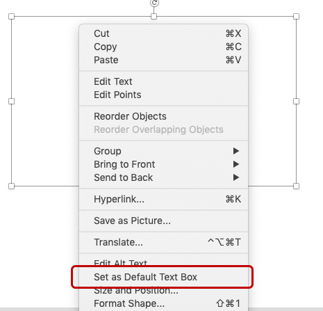
why don't you capitalize your graph titles?
Through virtual and in-person workshops around the globe, we have taught tens of thousands of people how to communicate effectively with data. This series captures some of the noteworthy questions we hear during those sessions—and our answers.

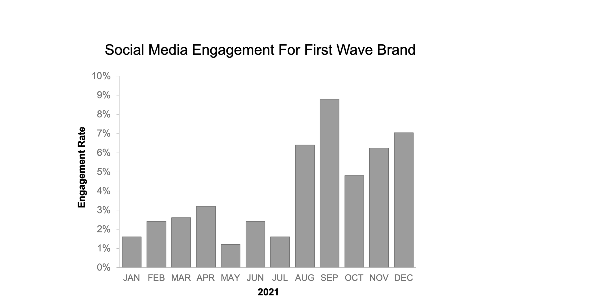
In school, I was taught that you should center-align and capitalize the first letters of words in titles. I’ve noticed, though, that storytelling with data charts only capitalize the first word in the chart title, use ALL CAPS for the axis titles, and don’t center-align anything. Why?
This is a great question! There are good reasons why many tools use title-case, center-aligned text as the defaults for headers and titles—these formatting choices help that text stand out.
Most written text is left-aligned, because it’s easiest to read. Center-aligned text tends to grab a reader’s attention due to its contrast with other text on the page.
Capitalizing every word in a phrase helps set it off from surrounding text, and makes it seem more formal and important.
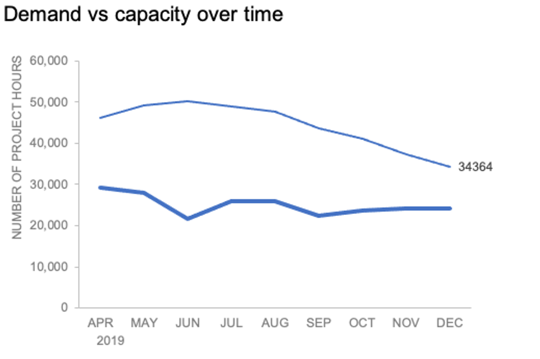
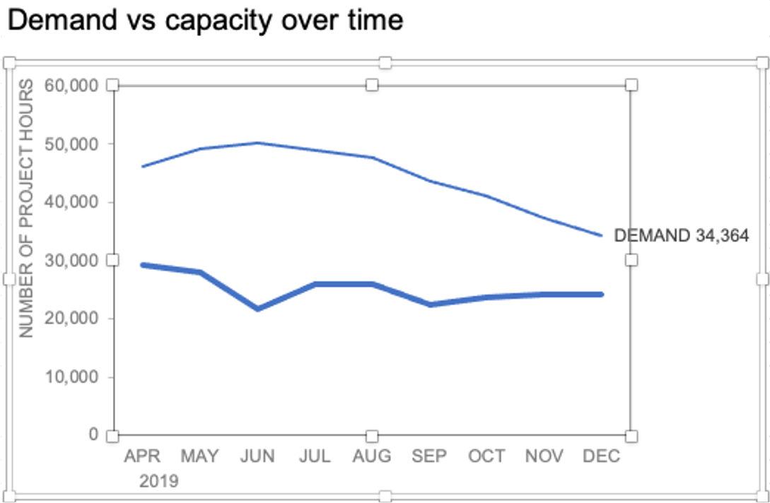
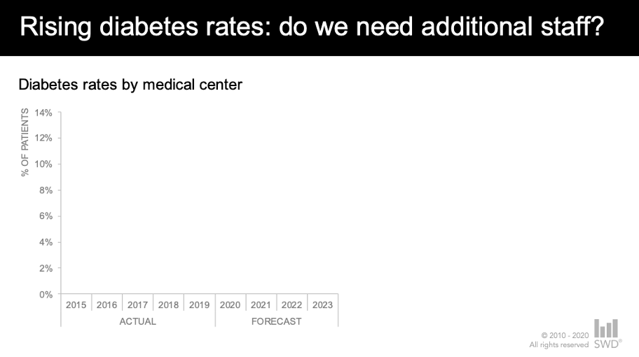
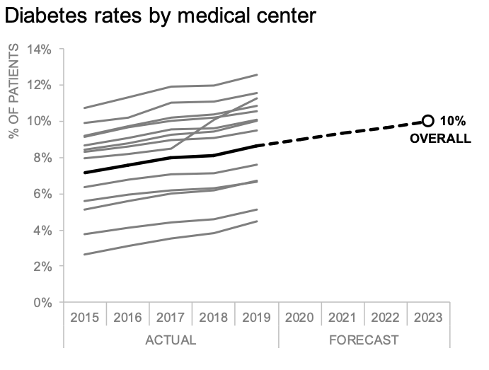
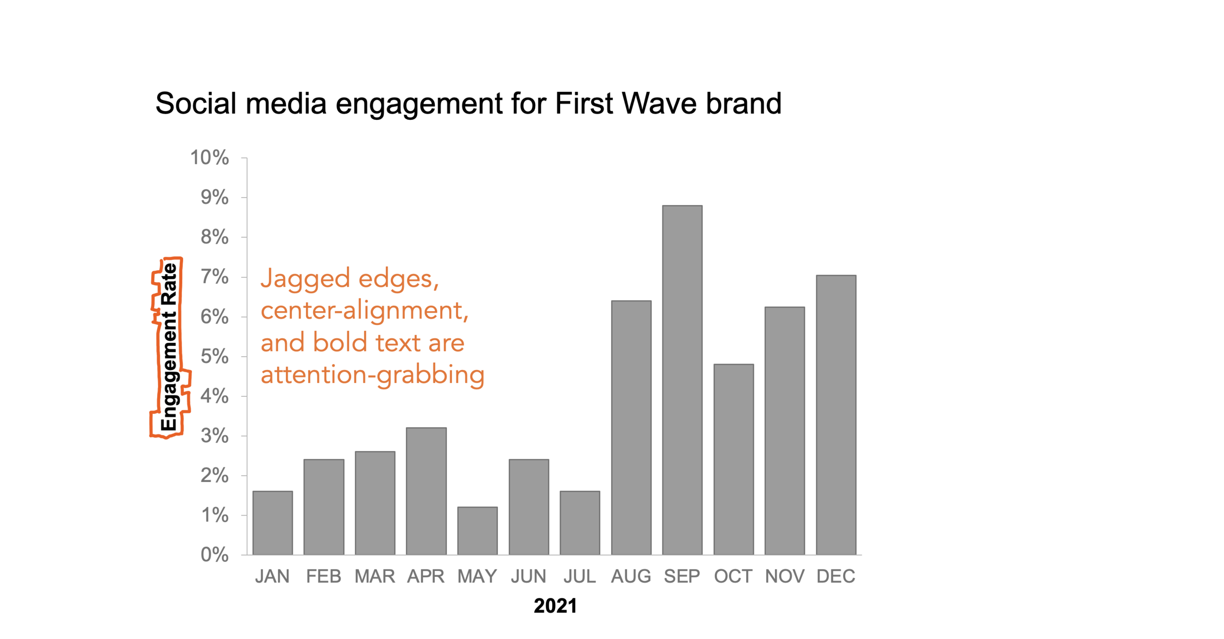
In this bar chart, the header and the axis titles are following common default settings. The text is centered with each word’s first letter capitalized (“title case”), and the axis titles are in bold.
In graphs for business communications, though, the title shouldn’t be the element that stands out the most. It will certainly provide important context for the viewer, but data and insights should be the stars of the show. Some slight tweaks to these default settings can make the title a stronger supporting player, without stealing focus from the key elements of a communication.
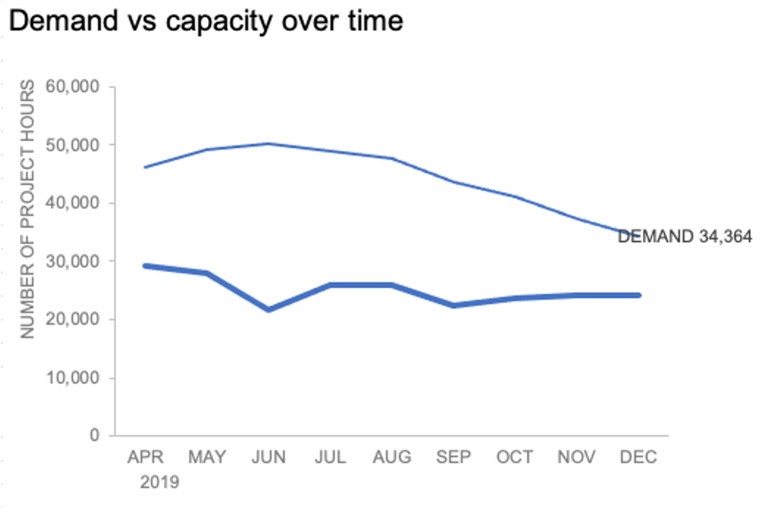
Left-align graph titles for visual framing
Center-aligned text helps a reader to see that a new chapter, section, or page of text is about to begin…but a graph is already easily distinguishable from any nearby text, and doesn’t need center-aligned titles to emphasize that difference.
Left-aligning chart titles creates a visual frame around the graph, without requiring us to draw any additional lines. Putting the title in the top left also ensures that a viewer sees that important context first.

Left-aligning the title creates a visual frame around your chart, without the need to draw in additional borders.
Use sentence case for clarity and speed of comprehension
Title case does a great job of setting text apart from any surrounding words…but in our graphs, the title sits on its own, and doesn’t need that kind of distinction. Sentence case—in which one capitalizes only the first word of our titles—offers several advantages:
It is easier and faster to read, especially in a longer block of text. It Should Be Clear In an Instant That It Is Not Easy or Pleasant to Read the Text in This Particular Sentence When Every Word Is Capitalized.
Sentence case feels less formal and more approachable than title case, which can be beneficial in those situations where your audience might be unfamiliar with the data you are presenting (or with data in general).
Proper nouns are hard to pick out when we use title case; sentence case makes them easier to see.
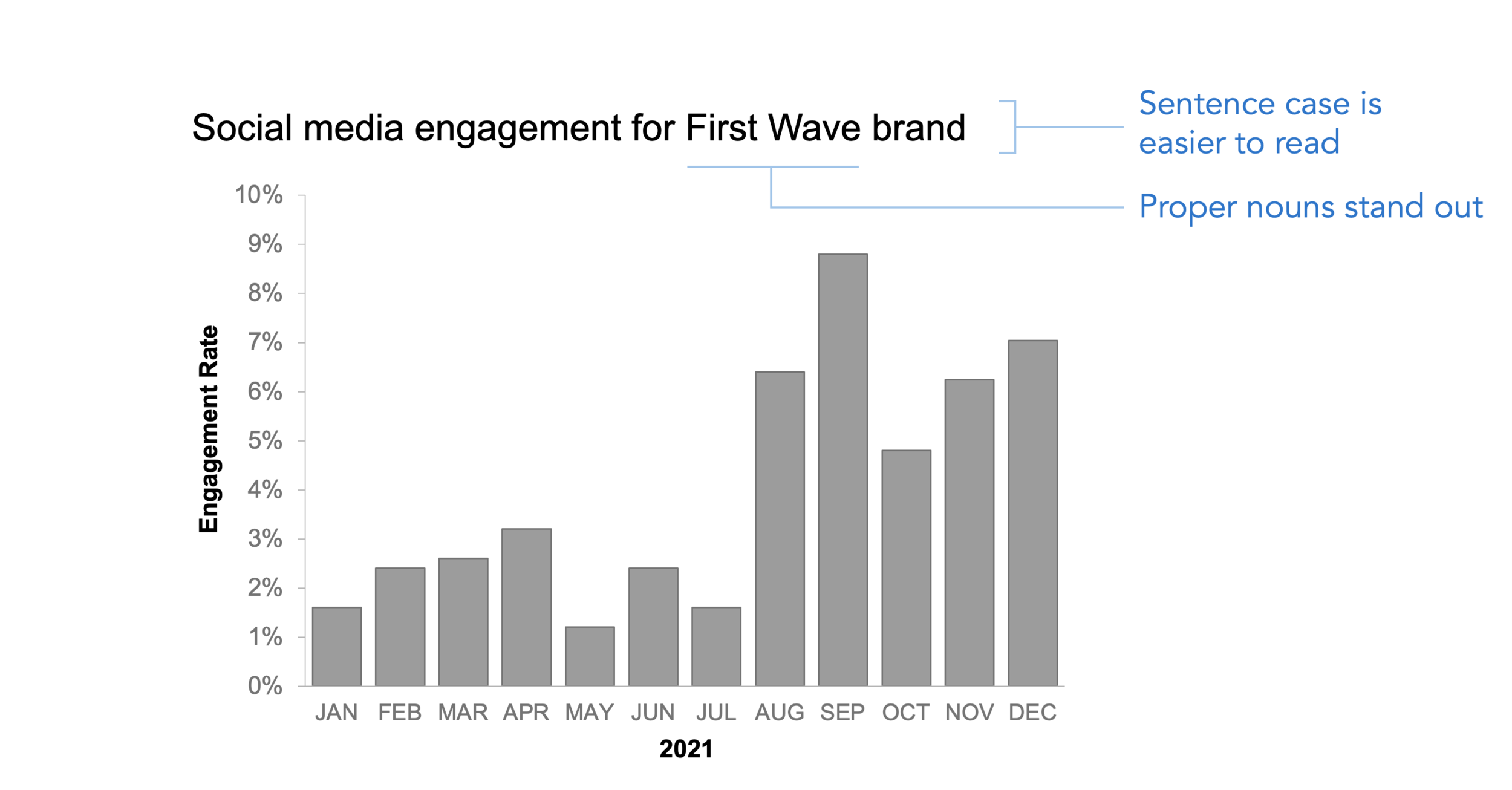
Use sentence case in your chart titles to make them easier to read, and to make the visual feel more inviting for an audience.
Make axis titles easy to find and easy to ignore
Axis titles provide important information to a viewer of the graph, but they shouldn’t be distracting. Instead, they should be easily discoverable, while at the same time can fade into the background. They’re part of the skeleton of the graph—providing structure, but letting the data itself take center stage.
Axis titles provide important context, but they shouldn’t stand out or draw attention away from the data.
There are several ways to achieve this “easy to find, easy to ignore” balance in axis titles:
Set the text to a neutral, but readable, gray color;
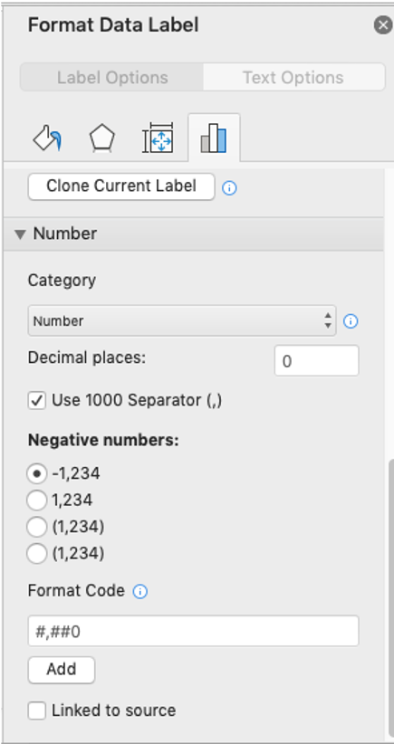
Use ALL CAPS, so the title’s outline is a regular rectangle, rather than a jagged mix of “ascenders and descenders” (the parts of lowercase letters that stick up above the average height or drop below the baseline of the font); and
Align them to the top of the y-axis or the left of the x-axis so that they can always be found easily, and so that they also create implicit (rather than actual) borders around our graph.

Some techniques for making axis titles useful without being overwhelming include using a neutral text color, writing the titles in all caps, and aligning the titles to the top of the y-axis and the left of the x-axis.
Keep in mind, of course, that these choices are not right or wrong; they merely reflect our data storytellers’ styles, preferences, and priorities. In business, it’s important to maximize understanding and clarity in charts, and these choices are all about accomplishing that most effectively. If your organization has an established style guide or follows other existing guidelines (e.g., AP, Chicago, APA), then stick with those conventions. Otherwise, consider the impression you want to make on your audience, and make your own capitalization and alignment choices accordingly.
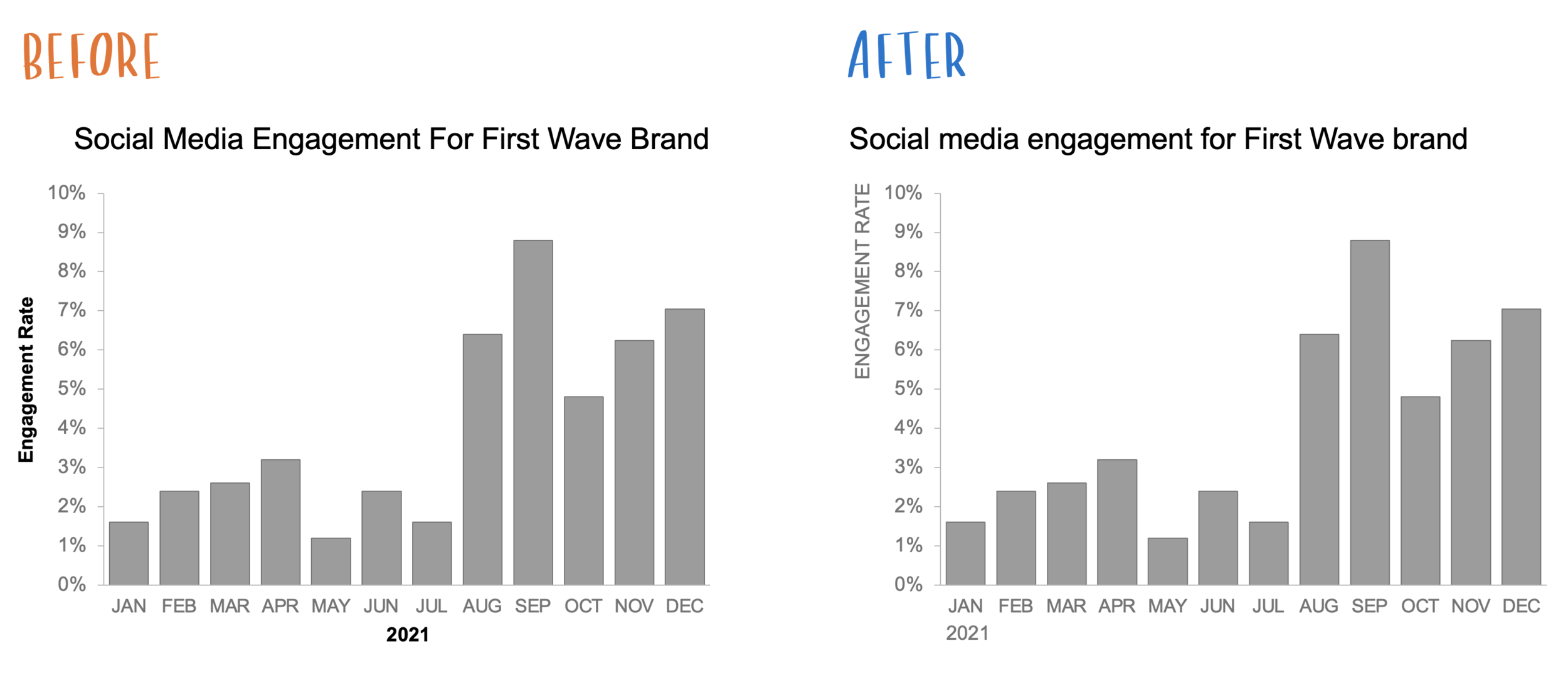
A few small changes to default settings for chart titles and axis titles can make visualizations cleaner and more approachable, while at the same time making the data and the insights easier to understand.