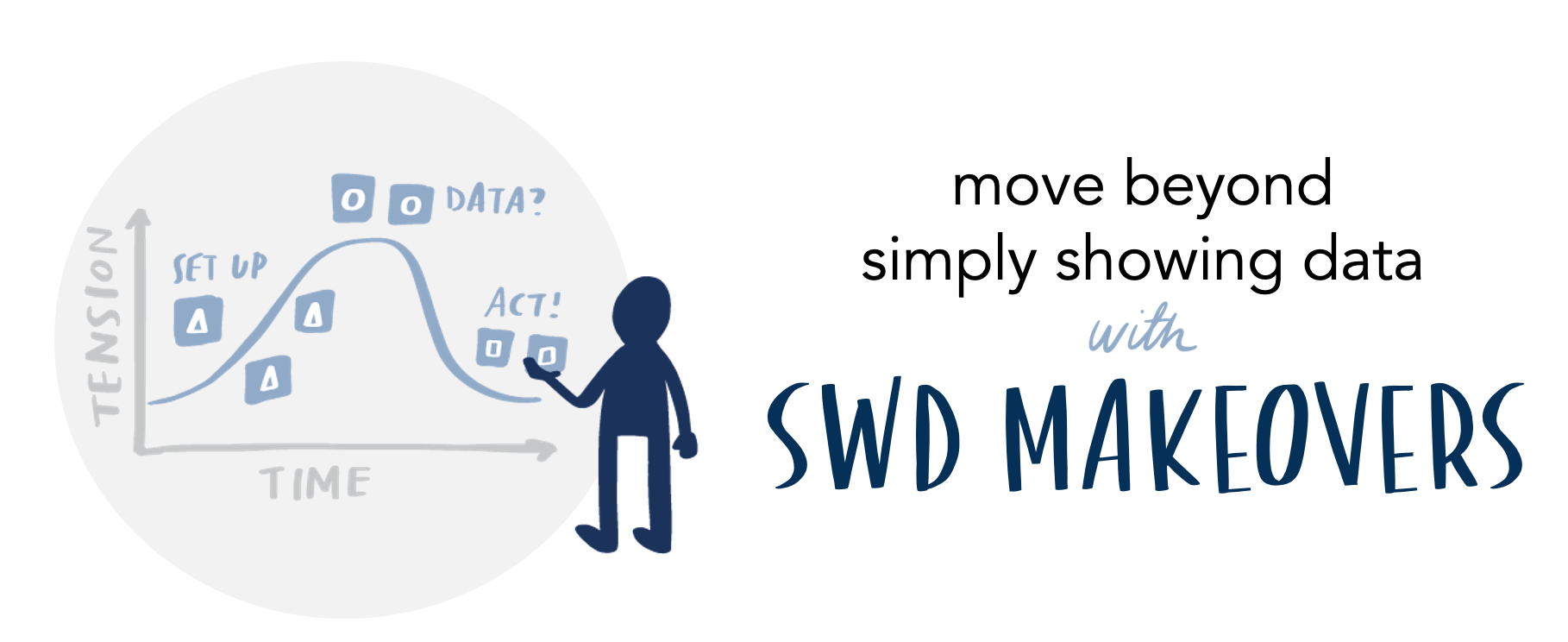
Any data visualization tool can create a graph—but it doesn’t know your data, stakeholders, and organization like you do. We invite you to explore the following storytelling with data examples for tips on how to bring data to life!


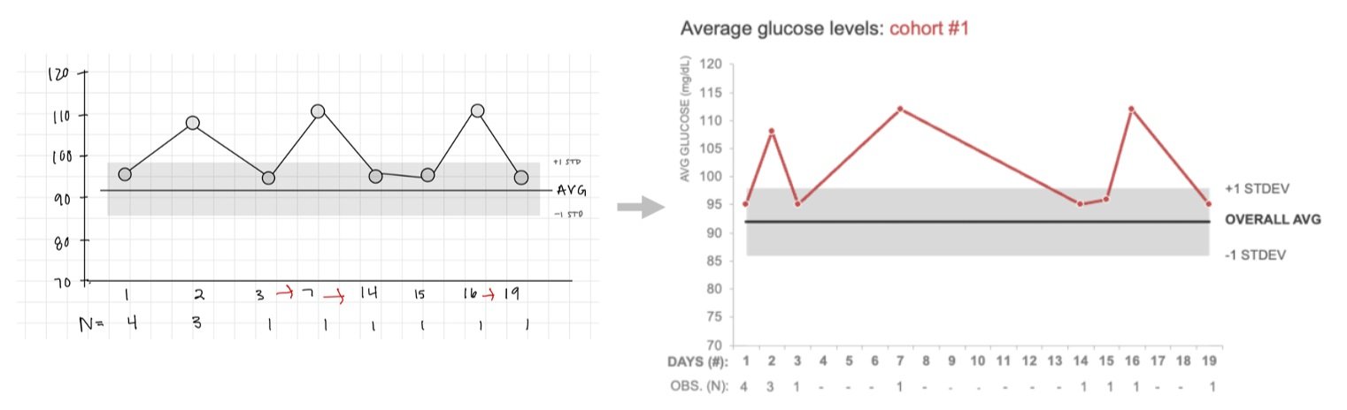
Before
After
The Huberman Lab Podcast
Explore the latest episodes on neuroscience, health, and wellness.
Podcast Episodes

Episode 1: Introduction to Neuroscience
Learn about the brain and how it shapes our behavior.
Listen
Featured


Featured
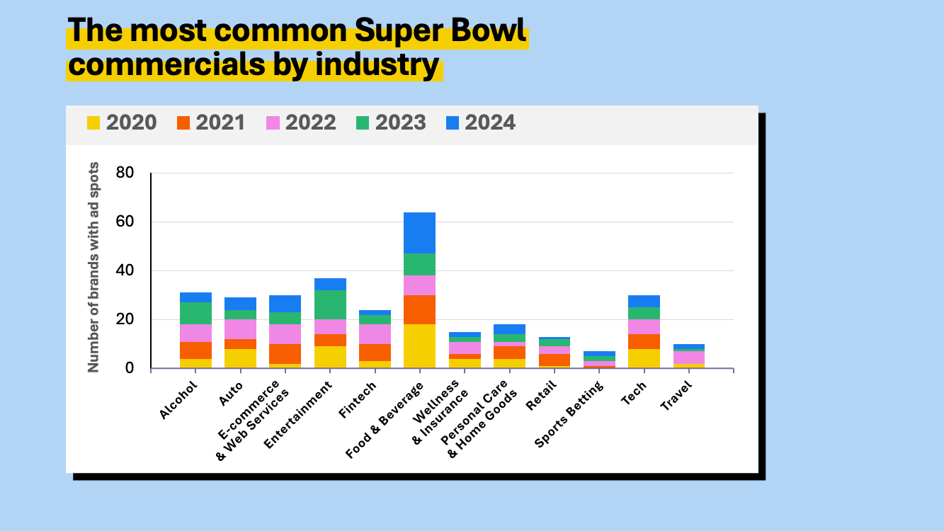
Posing questions as slide titles can feel interactive, but they can create unintended problems for your audience. Learn how clearly stated takeaway titles help focus attention on what matters and support better discussion and decision-making.