Featured


This client case makeover—one of our favorites that almost made it into the new book—shows how simplifying a complex forecast can turn confusion into clarity and insight.
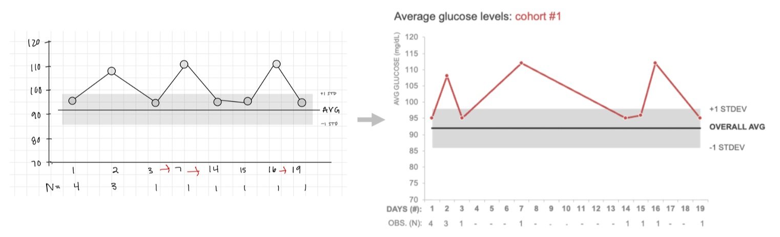
A heartfelt data journey reveals how sometimes, the most powerful story comes not from charts—but from choosing a simpler, more human way to show progress.
When every slide is packed with shorthand, the real message can get lost—clear language isn’t just polite, it’s powerful.
Posing questions as slide titles can feel interactive, but they can create unintended problems for your audience. Learn how clearly stated takeaway titles help focus attention on what matters and support better discussion and decision-making.